Enter a supermarket and it feels like all the bustling aisles have filled themselves with colorful products – each trying to catch your attention with their look. Now the product that gets picked most of the time wins one game for sure: the game of irresistible packaging.
But what exactly goes behind that winner? How can an FMCG brand ensure its packaging is a standout in this crowded marketplace? Stay till the end to find out.
The Art of Packaging
For the common eye, packaging design is an interplay of aesthetic layouts and splash of colors created to entice the customer. Be it a regular bath soap or a daily staple like the atta we use regularly in our kitchen, each product comes packed in a well-designed package. This design has an identity of its own, so much so that you can identify the product even if the brand name is missing.
Therefore, packaging design is just more than aesthetics – it’s the identity of a brand. It’s the first interaction with the customer and the lasting memory for your brand. It entails a number of key components – structure, color, typography, and graphics, which can collectively tell the story of your brand. It is a strategic endeavor that can make your brand rule the shelves not just in the markets, but at the homes of their owners too.
Building a Memorable Packaging Strategy & Design
FMCG, as the name says, are fast-moving goods. People buying them often are in a hurry or are pre-accustomed to their favorites, which sometimes run down generations. So, it’s quite tactical to build a memorable packaging design that:
- Stands out in the clutter for those who are scanning the aisles quickly
- Can change the pre-conceived notions of those accustomed to competition
Hence, you must focus both on the creative as well as practical aspects of design. It should be able to tell why someone should purchase your product over the rest. The strategy should not only appeal visually but also function effectively – enhancing the product and improving the consumer experience.
To achieve that, start with understanding the basics of packaging design.
ABCD of Packaging Design
Packaging design is a technical art. This means there are some fundamentals that are central to creating any packaging design. Knowing the technical know-how can guide you in creating a foolproof design strategy for your FMCG brand. Here are some of the key aspects:
- Dieline: It is the blueprint for your design that can give you an indication of how your design will be physically constructed. It contains markers that show where the material will be cut, where it will fold, and where elements like glue tabs will go. It’s crucial to ensure that your design translates correctly from a digital layout to a tangible product.
- RGB v/s CMYK: These are the two-color schemes on which most design software work. While RGB is a mixture of three primary colors – red, green blue; CMYK has four color components – cyan, magenta, yellow, and key/black. These inks are mixed in different proportions to produce accurate colors on different mediums. When designing, use RGB for digital outputs and CMYK for printed materials. Selecting the apt color model will ensure that your design looks its best, whether it’s on a screen or in your hands.
- Design Tools and Software: Design tools and software are essential for bringing creative ideas to life. There are numerous software and tools that designers utilize to create packaging designs. Some of the finest software includes Adobe Photoshop for photo editing, Illustrator for vector graphics, and InDesign for layout design. Figma and Sketch are favorites for UI/UX design, offering collaborative features.
- Print: Print design involves creating visuals intended for physical output, such as brochures, posters, packaging, and magazines. Unlike digital design, print requires careful consideration of factors like resolution (usually 300 DPI for clarity), color mode (CMYK for accurate color reproduction), and bleed (extra space for cutting). The goal is to ensure that the design translates perfectly from screen to paper, maintaining quality and consistency across various printed materials.
When you figure out the basic technicalities that can help you in creating good designs, the next step should be knowing what a good design includes. For that, there are 4Ps that the industry follows.
4Ps Of Successful Packaging Design
Here are the factors that can make or break your product design:
Packaging Material: Something soft for soaps, sturdy for shampoos, and something shiny for snacks – the right packaging material means the right eyeballs. It doesn’t only give your product an identity but also ensures it stays fresh, contact, and in the right conditions. The kind of packaging material you use tells a lot about your brand ethos as well, for eg, sustainable packaging creates better trust in customers these days.
Packaging Design: The next is the design – which is also a reflection of your brand story. This will encompass all visual elements, right from the color to graphics, to typography, and even the tone of the text used on the packaging.
Packaging Strategy: Your packaging strategy is the mirror of your brand strategy. It tells people what they mean to your brand and what your products can mean to their lives. Therefore, your strategy should be consumer-centric, focusing on how the packaging will be perceived, used, and disposed of.
Packaging Functionality: Your packaging should have a purpose of more than just holding the product in. It will be incredible if it is easy to open, easy to store, and able to keep the contents fresh. It should also have a reuse value to keep your product on top of everyone’s mind.
But how do you define these 4Ps? Well, the simplest way is to identify what you want to sell and to whom. You can follow the following strategy to do that.
Decoding the Key Elements of Packaging Design
There is a lot that goes behind creating a successful and memorable packaging design. There goes in a lot of research, strategy, and intent-based planning in curating designs that tell a tale, reach the customer’s heart, and prompt them to make the purchase. Here are some elements that cannot be missed:
- Target Audience: Who are you trying to reach out to: is the first question you must answer when planning your packaging design strategy. Very different elements appeal to distinct sets of customers. For example, kids will be attracted to something vibrant and fun while working class people would like to invest in products that appear reliable and trustworthy.
- Packaging Requirements: You cannot pack chocolate in the same packaging as soap. You cannot pack a bar of chocolate that has to be kept in a humid city in the same material as you would pack it in for a colder climate! Therefore, to create a good packaging design, you must understand your product well and also how and where it will be kept when purchased.
- Facts, Strategies, and Considerations: What is your brand all about? What are the various safety and regulatory guidelines that you need to follow? How can you make the packaging sturdier and more appealing? These are some factual considerations that must form the strategies for your packaging design. For example, if you are creating a product for the visually impaired – your packaging must consider the limitations they might follow and cater to them.
- Packaging your Packets: Your packaging design should be a complete package in itself. It must meet all your requirements, guidelines, and customer preferences, and should still be able to stand out in the crowd.
- Developing Better Packages: The best thing you can do to create striking packaging is to not settle on the first best design you see. Keep improving, fixing things, adding elements, and making it better. Keep reworking till you create something incredible and inimitable.
- Quality is Key: While focusing on design elements that stand out, do not compromise on the quality of your packets. They must be sturdy, and sustainable, and should be able to drive more value for the customers.
- Follow All Guidelines: Be it government regulations or your own brand guidelines, do not miss out on important elements in your packaging design. For example, all eatables must have complete nutritional information on their packets in India – to fit in design elements you cannot put this crucial aspect out.
When you are sure that you have all the material ready and are sure about what you want to show your customers, start with building a packaging design.
9 Steps to Design Your Packaging
As we said, packaging design is a science and follows certain procedures to be created. You need to follow the right approach methodically to ensure you are curating something that stands out and is unique and can create an unforgettable brand image for you.
- Pick the Right Material: Start with choosing the packaging material that is most suited for the kind of products you are selling. For example, cereals often come in cardboard boxes, shampoos in pet bottles, and various flours in plastic/jute bags. Your first step should be to identify what will suit your product the most.
- Form a Dieline: Once you know the material, you need to figure how it folds, how it lands when placed upright, how much space you would need to glue in the edges etc. This will help you in creating a dieline that will define how your final packaging design will look. It must include markings for all elements, cuts, folds, creases, glue-ins, etc.
- Identify Your Brand Identity: Right from the colors that define you to the typography, to the logo, and even the tone of the text that will go on the packaging should reflect your brand identity.
- Follow Color Theory: Yellow is happy, red is angry, and green is eco-friendly; these are just a few of the color theory examples that you must incorporate in your brand design. People associate strong emotions with certain colors, and you need to capture that effect with your design
- Choose the Best Font: Is your brand more fun or serious? Is it a necessity or something to indulge in? Is it moderately priced or premium? The font that you put on your packaging can tell all these and a lot more. Therefore, choosing the font will also choose the customers that come and pick your products.
- Labels are Essential: You need to label your products and talk about their ingredients, where they were produced, allergy information, etc. There should also be clear instructions on how to use the product, how to store it, and how to discard it. Don’t assume the customer knows anything. Define everything for them.
- Stylise with Graphics: Once the necessities are in place, you can now amplify your design by using the right graphics. Include signs, symbols, photos, word play, or anything that aligns with your brand values & identity. This will help you build personal bonds with customers.
- Focus on Digital v/s Print: What you see on the screen will not be exactly how it will look after getting printed. Therefore, you must ensure precision in color and size ratios of your design.
- Test The Design: Once all is ready, you must send some products out to the market to test their success and viability. This will help you improve later.
Once you have done all this, gather feedback and refine your design to ensure it meets consumer needs and expectations. You can also follow some trusted hacks to make sure that your design is creating the impact you desire!
5 Essential Hacks to Consider While Designing Packaging
All successful strategies have mantras that build them. For designing packaging and brand identity, you must follow the following hacks – tried and tested mantras that designers have been following for ages now:
- Clarify All About the Product: Your packaging should not be confusing, and you must be able to communicate what your product is right from the first glance. Be it the choice of colors or more evident graphics, they should be as transparent as you make them. When you see the packet of Dairy Milk, for example, you know it is a milk-based chocolate, right?
- Visualize Its Placements: How it will look on the posters, in the ads, on the shelves, and even when someone is carrying them – you must know how different placements can impact your brand visibility. This will help you create interesting stand-out points in your designs.
- Keep Extra Space: For discounts, offers, and challenges – you must keep some extra space on your designs. This will cut your costs and time during special occasions and will ensure that your core brand design stays intact.
- Simplicity is Powerful: The simple it is, the easier it is to remember! You want your customers to understand you and always reach out for your products in the market. Only simple and creative designs can do that.
- Minimalism the Season: The modern-day design elements are all about minimalism and plain objects. From edged and easy-to-read font to primary colors in the focus, to simple graphics, you need to opt for clean, minimalistic designs that are both modern and effective.
If you follow these hacks, you will attain a high recall value among the customers. A number of brands have achieved phenomenal success already by following these basic guidelines.
The Finest Packaging Designs with High Recall Value
Here are some examples of popular brands whose packaging designs are most memorable and created a distinct success story for them:
- Coca-Cola: The curved bottle design, simple white & red elements, and a font unique to the brand – Coca-Cola has had a very neat and simplistic design strategy supporting them. They even created a full-fledged campaign wherein they showcased just people’s hands forming the shape of their bottle and not even a single person could fail to identify what they were talking about.
- Apple: Possibly the sleekest and most minimal brand design in today’s time – Apple has won the world over with a partially eaten fruit for a logo. Their packaging tells the tale of their premium products – it’s soft to touch, delight to unbox, and sophisticated in its visual appeal.
- Trident Gum: It’s simple, compact, and refreshing to look at. Trident Gum sells an experience right from the packaging. It will make you reach out for the freshness, the cool breezes, and a happy smile all the time.
Granth Expertise
Granth has worked on creating a similar impact for a number of brands. We pride ourselves on creating packaging designs that not only look great but also perform exceptionally well in the market. Here are some of our success stories:
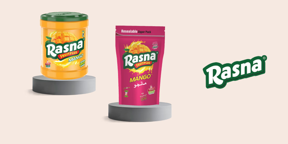
- Rasna: The packaging of Rasna aims to capture the vibrant essence of childhood. Therefore, we have chosen a bright interplay of colors – hues of orange, that also mimics the fruit inside the drink. A hint of green adds a touch of nature and breaks the monotony of the design. The font is bold, stand-out, and fun. The design is smartly crafted to reflect the fun, refreshing nature of the drink, making it irresistible on the shelf. Every element, from the bold logo to the juicy fruit illustrations, screams freshness and energy.

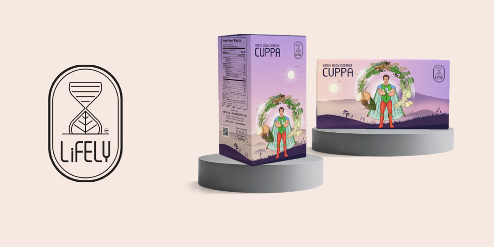
- Lively: The packaging of Lively effectively communicates its healthy, stevia-based brand proposition through the use of vibrant, natural colors, particularly shades of green. Superhero characters on the package give it a unique brand identity and a trusted figure who appears to be a life savior. This also makes the packaging memorable and appealing, especially to families and younger audiences. The fonts are very modern yet playful, binding together the whole appeal of a young brand rooted in philosophy of health for all.

Create Strong Recognition for Your Product with Packaging Designs
In the competitive FMCG landscape, packaging design is more than just an outer shell—it’s a critical tool for building brand recognition and driving consumer loyalty. By understanding and applying the key principles of packaging design, you can ensure your brand stands out on the shelves and in the minds of your customers. Let Granth help you create packaging that not only protects but also promotes and elevates your brand.


