- April 12, 2023
Mastering Minimalism: Captivate Your Audience with Sleek and Simple Branding
5 minutes to read

Can you recall the feeling of calm when you finally enjoy a cup of coffee sitting on your balcony after sorting out all your chores of the week. Do you recall the skip in your step when everything at home is organized and decluttered? Minimalist branding can be compared to timeless pieces in your wardrobe. Everyone probably has a little black dress or an Oxford shirt that they can wear at any time without looking out of style. Achieving the same kind of calm, clutter-free feeling and being a classic is the objective of minimalism in branding.
The philosophy of minimalism in marketing places less emphasis on things. The philosophy’s primary premise is to minimize the variety of elements, attributes, and capabilities in order to provide users with an intuitive experience. The majority of minimalist ideologies are developed with the knowledge that the client wants to feel like they are getting greater value for their money. As a result of the smaller number of items, these enterprises must work harder to create their products such that they are worthwhile.
1. Keep it Simple: The key to minimalist branding is to keep it simple. Focus on creating a clean, uncluttered design that is easy to understand and easy to remember. Use a limited color palette and simple typography to create a clean and elegant look.
2. Focus on Your Unique Selling Proposition: Minimalistic branding is not about being bland or generic. It’s about focusing on what makes your brand unique and emphasizing it. Identify your unique selling proposition and make it the central focus of your branding.
3. Consistency is Key: Creating a memorable brand requires a consistent brand image. A website and business cards are two examples that require consistent branding. To develop a unified brand image, use the same typography, color scheme, and artwork.
4. Use High-Quality Imagery: In minimalist branding, every element counts. Make sure the imagery you use is high-quality and relevant to your brand. Avoid stock photos and opt for original, high-quality images that reflect your brand’s personality.
5. Emphasize White Space: White space is an essential element of minimalist design. Use plenty of white space in your branding to create a clean, uncluttered look. White space can also help draw attention to your brand’s unique selling proposition.
6. Keep Your Message Clear: Minimalistic branding is not just about aesthetics; it’s also about clarity. Make sure your messaging is clear, concise, and easy to understand. Use simple language that resonates with your target audience.
7. Be Memorable: Being simple does not hamper the chances of being memorable. Invest your time in developing a distinct brand identity that stands out from the competitors. For a memorable brand picture, use bold font or a standout color scheme.
A brand called Minimalist came to my mind when I read this topic. The brand’s tagline is “Hide Nothing”. It is a skincare brand that focuses on using lesser, cleaner ingredients on your body. This ideology of the brand is not only reflected in their name, tagline and products but also on how the products are presented on the website, the packaging material and product design, even the words used for product description are clear and easy to understand.


Maintaining a consistent philosophy across all your brand elements gives your customers a coherent experience at every point of interaction with your brand. This idea also applies to minimalism. When you incorporate minimalism into your brand design, it takes on the characteristics of a philosophy that applies to all of your brand’s parts, both visible and invisible.
The logo, products, website, and visual merchandising in your stores are examples of tangible brand aspects. Intangible brand elements include your company’s cultural values, vision, mission, and level of customer service.
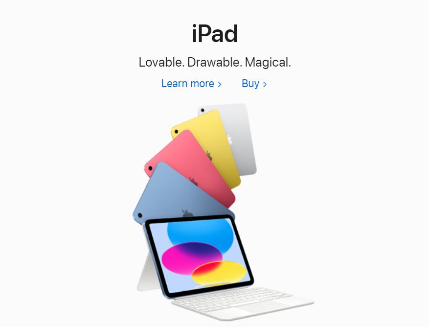
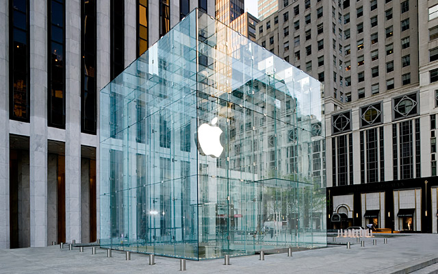
Another brand that embodies minimalism is none other than Apple Inc. From their words to designs to products and packaging even their store designs. The founder Steve Jobs set the tone for the brand and worked towards this vision. It is hardly unexpected that Apple, the business Jobs created, adopted the tenet that “simplicity is the ultimate sophistication” in its first marketing brochure and has stuck with it in both its product design and marketing approach. The two fundamental shapes used in Apple product design are circles and straight lines. iOS devices always include some variant on the two shapes, with a few exceptions. These steps help create brand familiarity and customer loyalty.


Creating a sleek and simple branding strategy can be a powerful tool for capturing your audience’s attention. By focusing on the above-mentioned minimalist branding strategies, you can enjoy the benefits of minimalist branding by creating a memorable brand image that resonates with your target audience. Before you go minimalist, you need to evaluate your brand and your customers’ needs first. Sounds like a lot, right? Turns out, it is. Contact Granth a leading branding agency in Ahmedabad, e will tread towards your brand’s success together.