









- Client PIXON Energy
- Industry Solar Energy & Renewable Energy
- Engagement 2024
- Scope Brand Identity & Digital Communication
PIXON Energy Case Study
Rebranding & Digital Presence for PIXON
Creating a new brand identity and carrying it across PIXON’s guidelines, website, company profile and social media

Layer 01: Introduction
Building a New Identity for PIXON
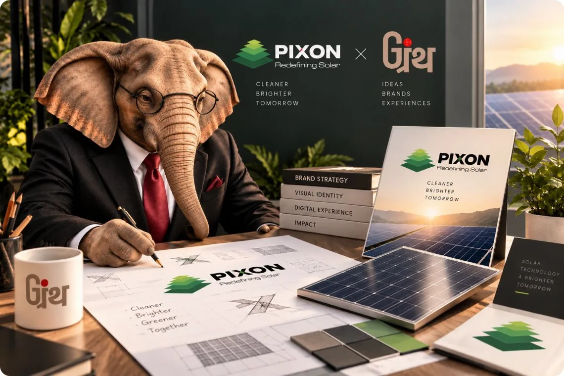
PIXON had a strong foundation in solar manufacturing but its identity needed to reflect the scale, technology and thinking behind the business.
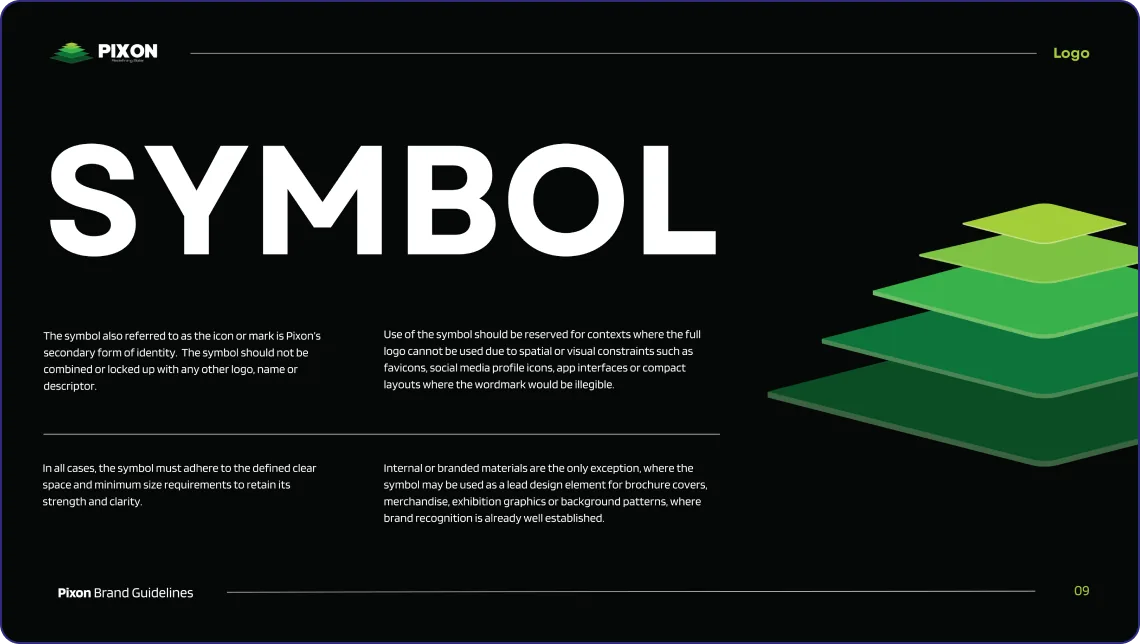
The new logo became the starting point. Its design was inspired by the five layers that make up a solar panel, bringing the product itself into the core of the brand identity.
From there, we extended the new identity across the brand guidelines, company profile, website and social media by creating a more consistent way for PIXON to show up.
Layer 02: The Five Layers
The Core of Every PIXON Panel
A solar panel is built through layers, each with a specific role. For PIXON, these layers became more than just a part of the product. They became the strategic foundation for the new logo.
- 01Tempered Glass
- 02Encapsulant — Top EVA
- 03Solar Cells
- 04Encapsulant — Bottom EVA
- 05Backsheet
Layer 03: The Story
From Solar Manufacturing to Advanced Energy Solutions
PIXON began in 2019 with a focus on solar module manufacturing. Since then, the business has expanded its capabilities across solar modules, encapsulant films and next-generation technologies.
-
Founded 2019
Headquartered in Rajkot, Gujarat, PIXON began its journey in solar manufacturing.
-
Manufacturing Modules & Films
PIXON expanded into solar modules and in-house encapsulant film manufacturing, strengthening its control over quality and production.
-
Technology N-Type · TOPCon · HJT
The product portfolio has evolved across Mono-PERC, N-Type, TOPCon and HJT technologies for different solar applications.
-
Advancement AI-Enabled Manufacturing
PIXON continues to invest in automated, AI-enabled quality systems and next-generation manufacturing capabilities.
Layer 04: The Logo
Built From the Core of the Panel
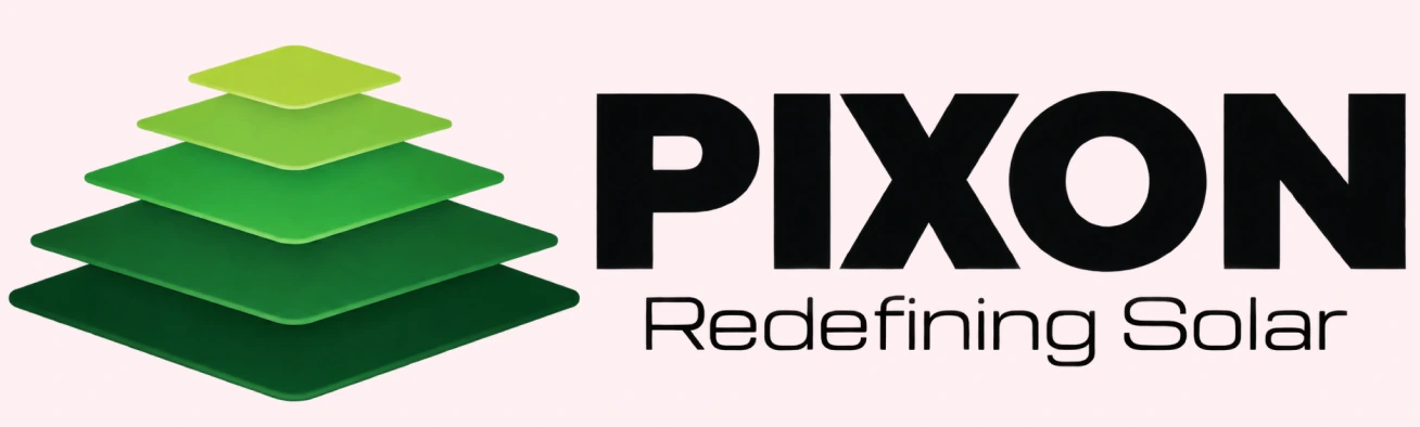
The new PIXON logo was shaped around what sits at the core of every solar panel, that is its five-layer construction.
We translated this structure into a distinctive visual identity, giving the logo a clear connection to PIXON’s product and the technology behind it.
Layer 05: The Brand Guideline
Giving the New Identity a Clear System
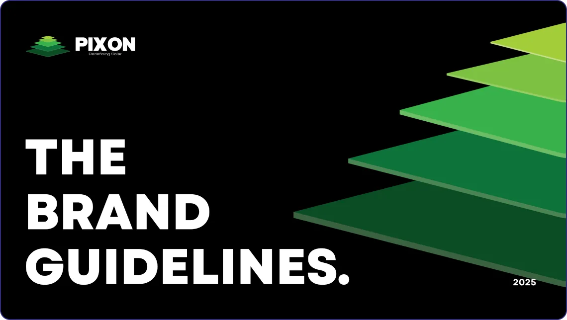
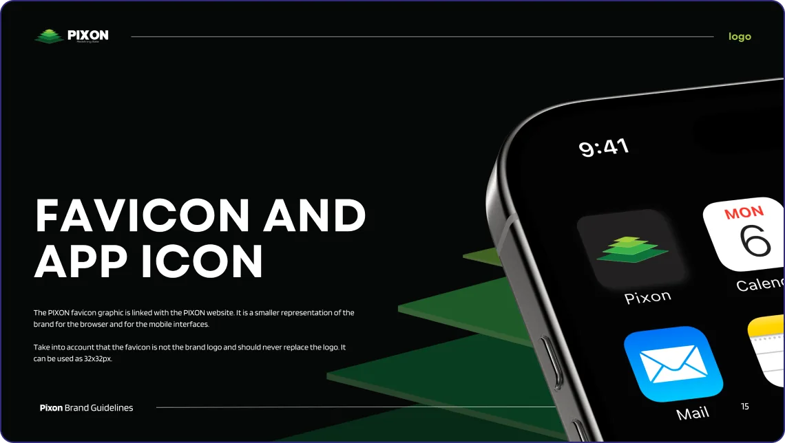
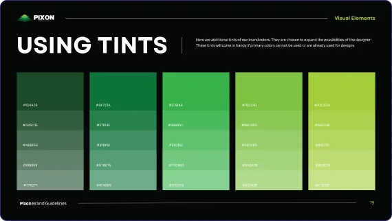
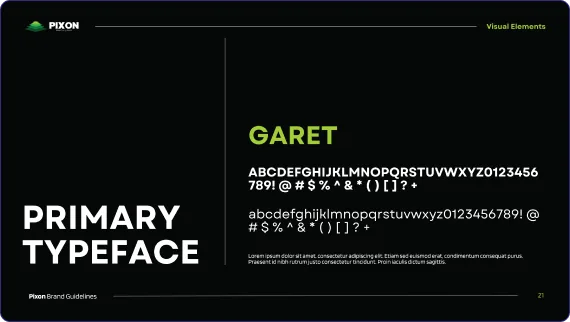
A new logo needs a system that keeps it consistent. We created PIXON’s brand guidelines to define how the identity should work across different formats and communication.
From the logo and color palette to typography, layouts and visual applications, every element was brought together to give PIXON a clear and consistent brand language.
LAYER 06: THE DIGITAL
Taking the New PIXON Identity Online
We carried the new PIXON identity into its website by creating a digital experience that brings together the company, its solar products, technology and capabilities in one clear space.
The website was designed to make PIXON easier to explore while keeping the new brand language consistent across the digital experience.
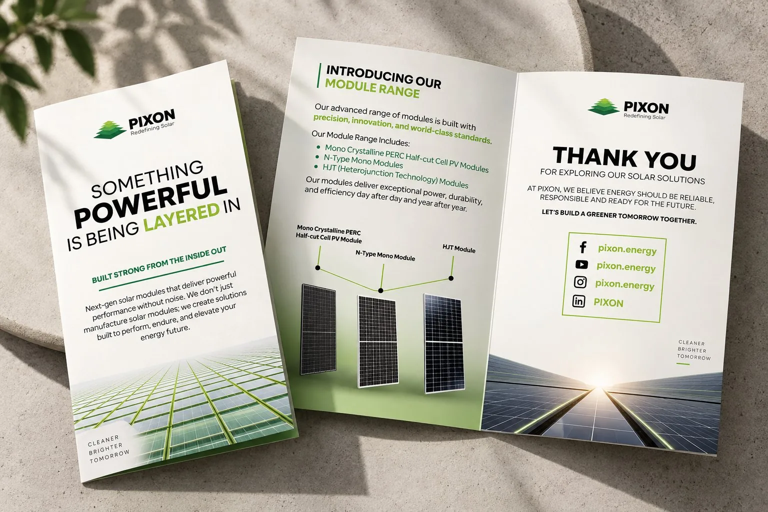
Layer 07: The Brochure
Putting PIXON’s Capabilities into Print
We extended the new PIXON identity into the company brochure, bringing its products, capabilities and brand story together in a clear and structured format.
The brochure was designed to make PIXON’s offering easier to understand while maintaining the visual language established through the new identity.
Layer 08: The Social
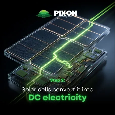
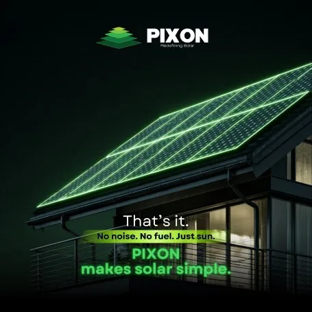
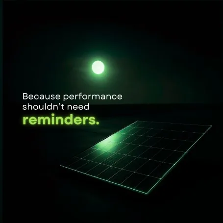
Giving PIXON a Consistent Voice Online
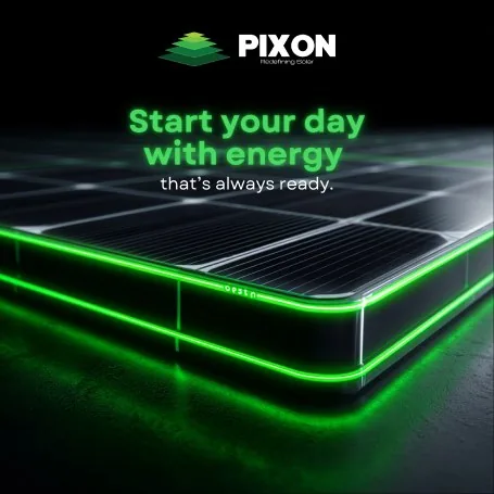
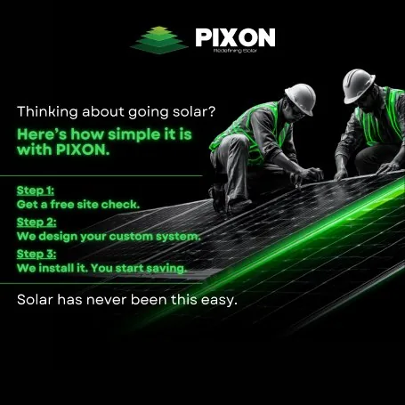
We carried the new PIXON identity into social media by creating content around its products, technology, manufacturing and solar industry presence.
Each communication was designed to stay consistent with the new brand language while making PIXON’s work easier to understand and follow online.
Layer 09: The Outcome
A New Identity with a Stronger Digital Presence
Identity
A product-led logo for PIXON
Consistency
A clear system across brand touchpoints
Communication
A stronger way to present PIXON
Digital Presence
A unified experience across website and social media
What’s at the Core of your Brand?
Let’s Find Together



 Chat
Chat