






- Client PMIX
- Industry Manufacturing
- Engagement 2024
- Scope Physical & Digital Brand Experience
pmix case study
Building a Stronger Presence for PMIX
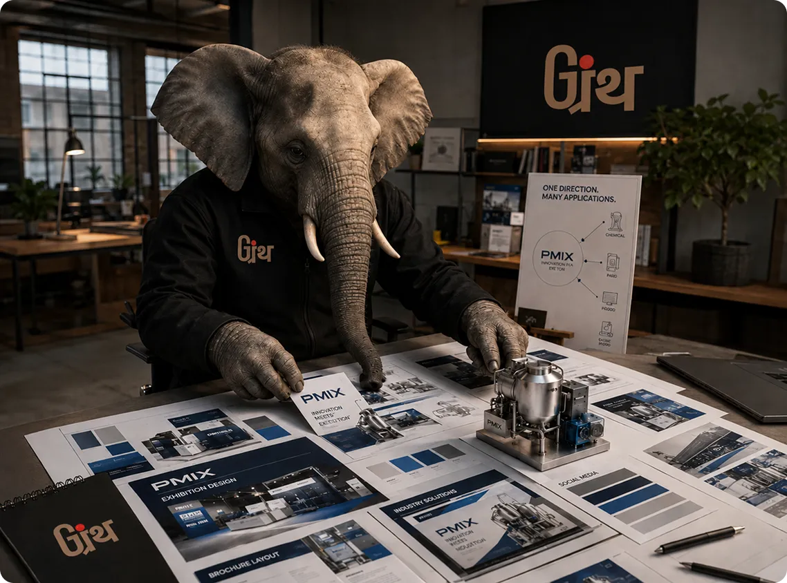
A cohesive visual experience designed to bring PMIX’s products, expertise and presence together across physical and digital platforms.

Mix 01: The Opening
One Brand. Many Places to Show Up
PMIX had a strong product story to tell, but that story had to work in very different spaces.
- On the exhibition floor, it had seconds to make an impression.
- In a brochure, it had to explain.
- On a website, it had to build confidence.
- On social media, it had to stay recognizable.
The challenge was to make all of these feel like PMIX.
So, we started with one question:
What could hold the whole brand together?
MIX 02: The Direction
One Idea had to Work Everywhere
PMIX did not need a different visual language for every platform. It needed a strong central direction that could adapt without losing its identity.
We developed a theme built around structure, scale and the strength of PMIX’s industry by giving the brand a visual language that could translate across physical and digital spaces.
The idea had to attract on the exhibition floor, organize information in print, create clarity online and stay recognizable on social.

MIX 03: The Challenge
Making Technical Feel Distinctive
PMIX operates in a category where products, specifications and technical information can easily dominate communication.
The challenge was to give all that information a stronger visual identity. One that felt structured enough for the industry but distinctive enough to be remembered.
CLARITY
Make complex information easy to navigate.
CREDIBILITY
Reflect the scale and seriousness of the business.
IMPACT
Create a presence that could compete for attention.
CONSISTENCY
Make every expression unmistakably PMIX.
MIX 04: The Work
Building the PMIX Experience
We carried the PMIX direction across every major brand touchpoint by creating a consistent experience from the exhibition floor to the digital screen.
Mix 05: Brand Guidelines
The Rules Behind the Recognition
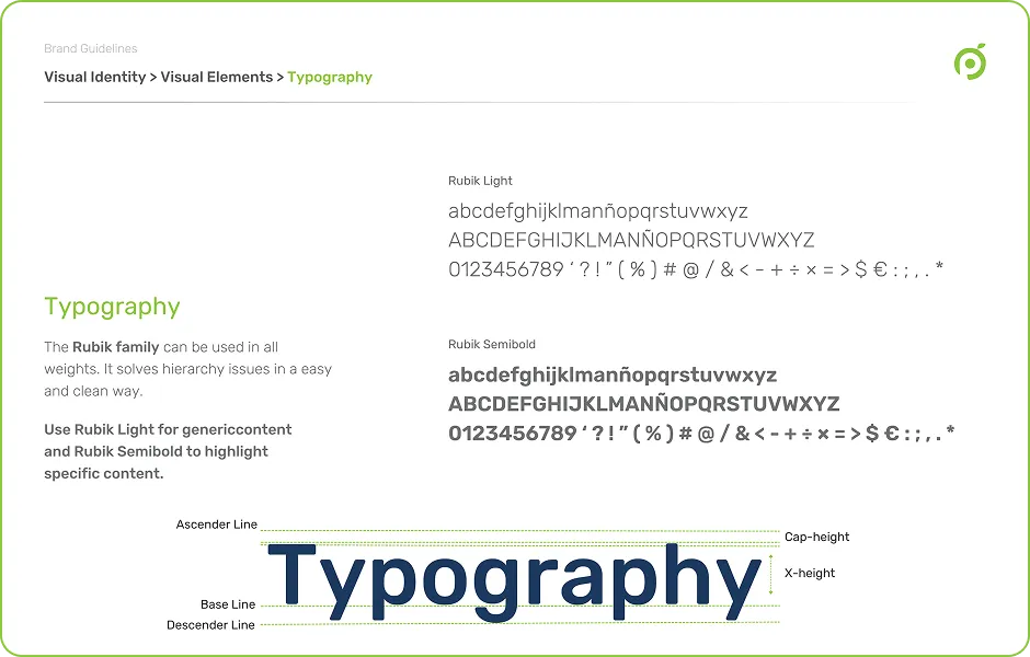
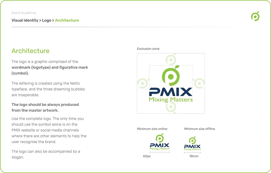
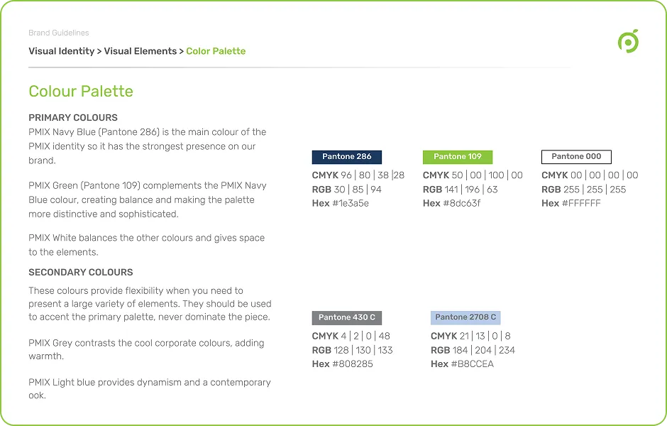
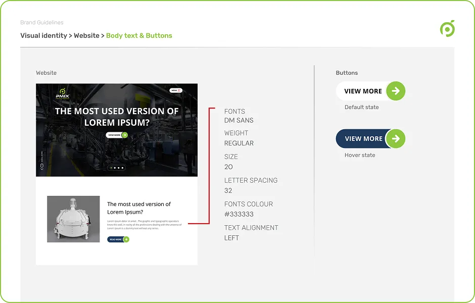
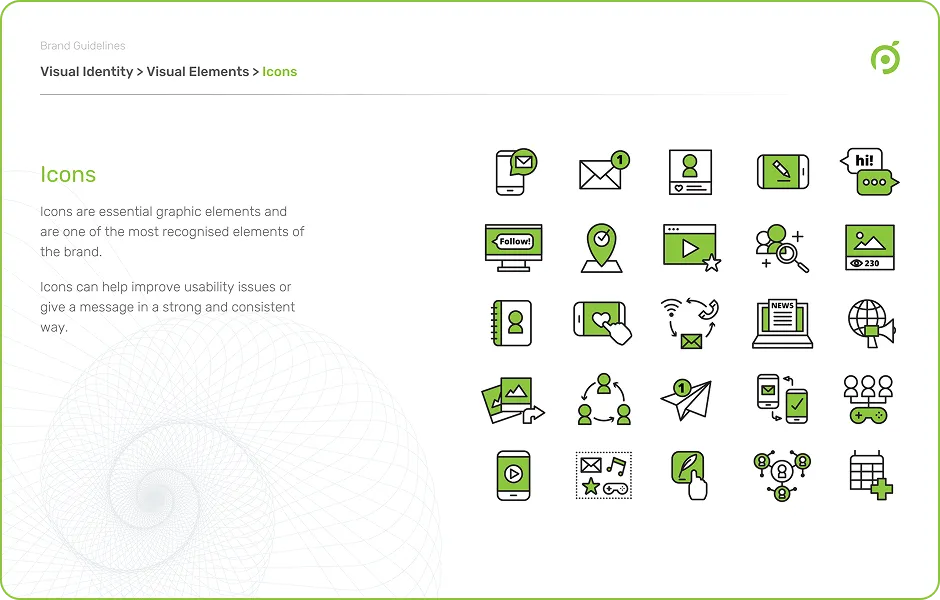
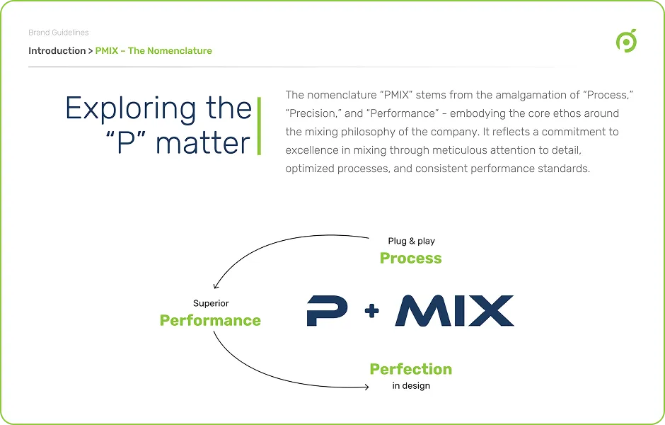
PMIX needed a visual language that could stay consistent across very different formats.We defined the core elements of the identity that are logo usage, color, typography, imagery, layouts and visual direction, into a clear brand guideline.It gave every future touchpoint a common starting point.
Mix 06: Theme Conceptualization
The Concept that Held it Together
Theme
Form
Structure
Visual Language
“PMIX knew what it needed to communicate. Granth built the system that helped people see it.”
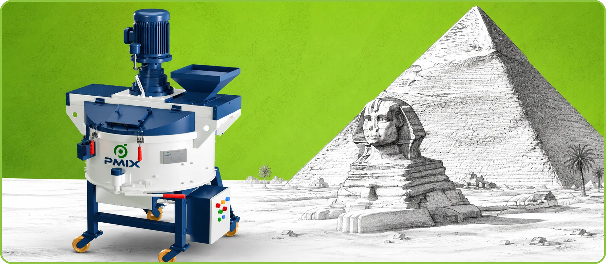
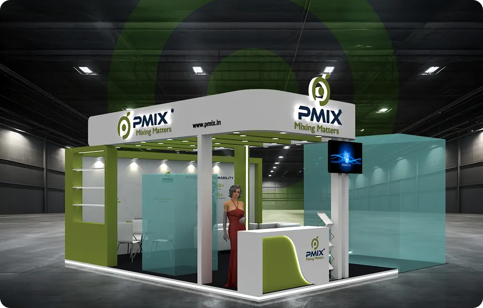
The exhibition needed a concept that could give the entire space a clear visual direction. We developed the theme around PMIX’s industrial strength, precision and forward-looking approach that translated those qualities into the stall’s forms,
graphics and communication. The concept became the visual thread connecting the space by giving the exhibition a distinct identity while keeping it unmistakably PMIX.
Mix 07: 3D Product Rendering
A Clearer View of the Product
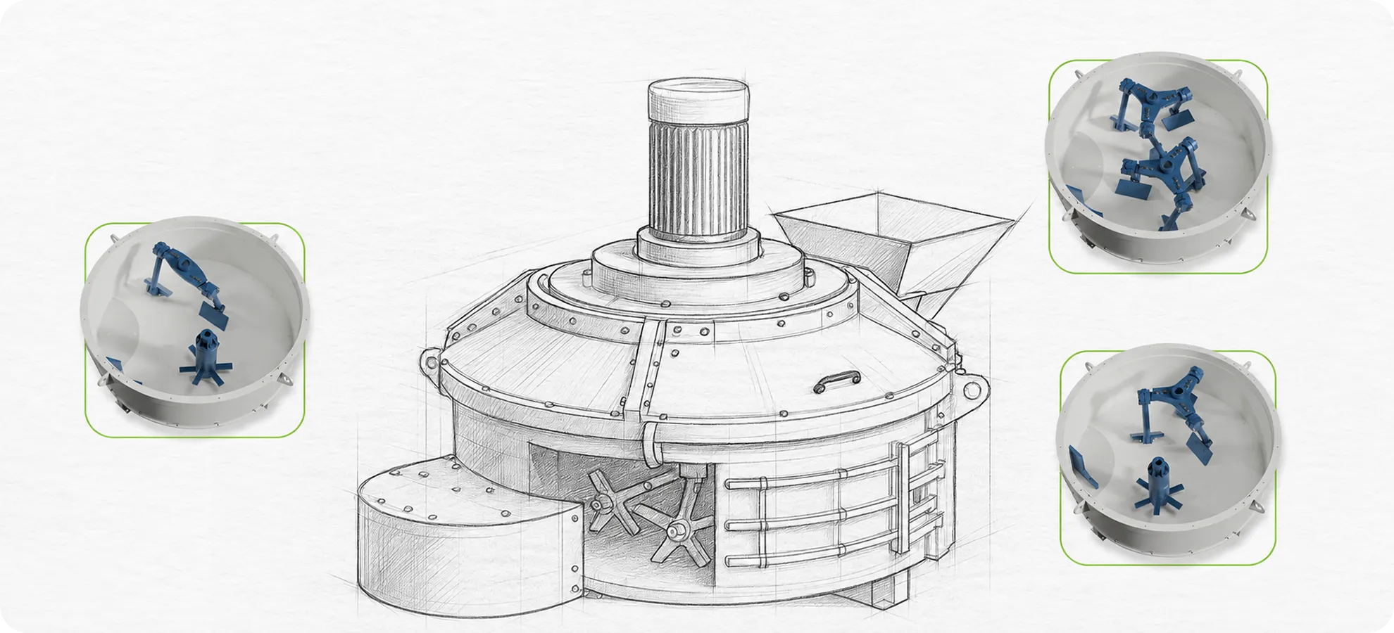
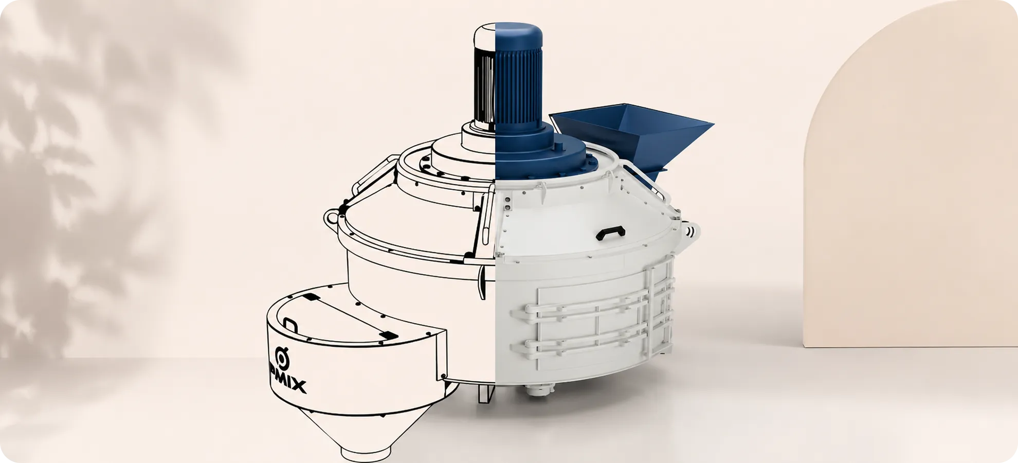
PMIX’s products needed to be shown with the same precision as the brand itself. We created 3D product renderings to give PMIX clean and controlled visuals that could be used across communication without relying on repeated photography. The renders brought out the form, details and finish of the products, while keeping them aligned with the visual language established for the brand.
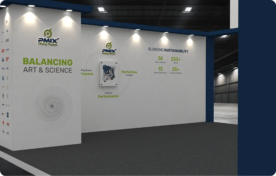
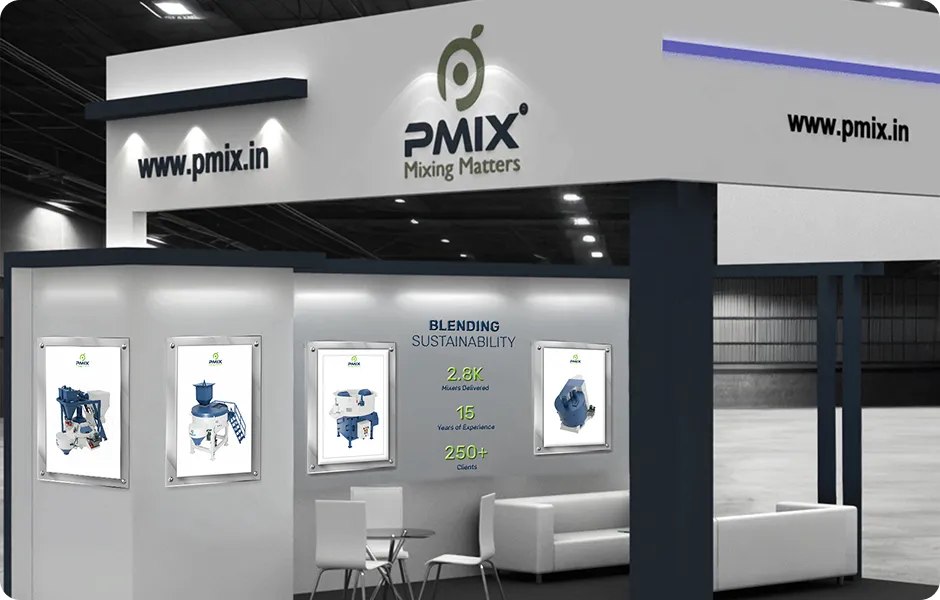
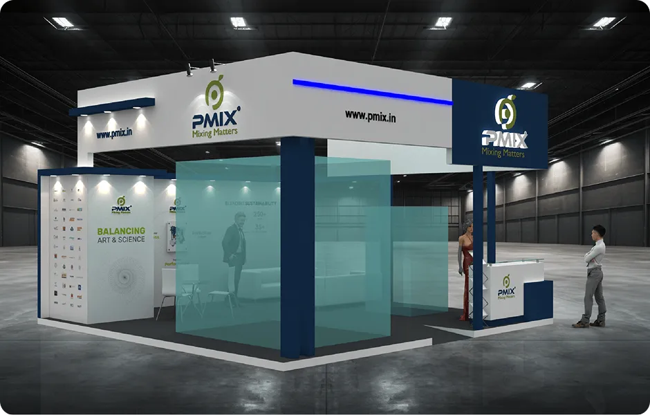
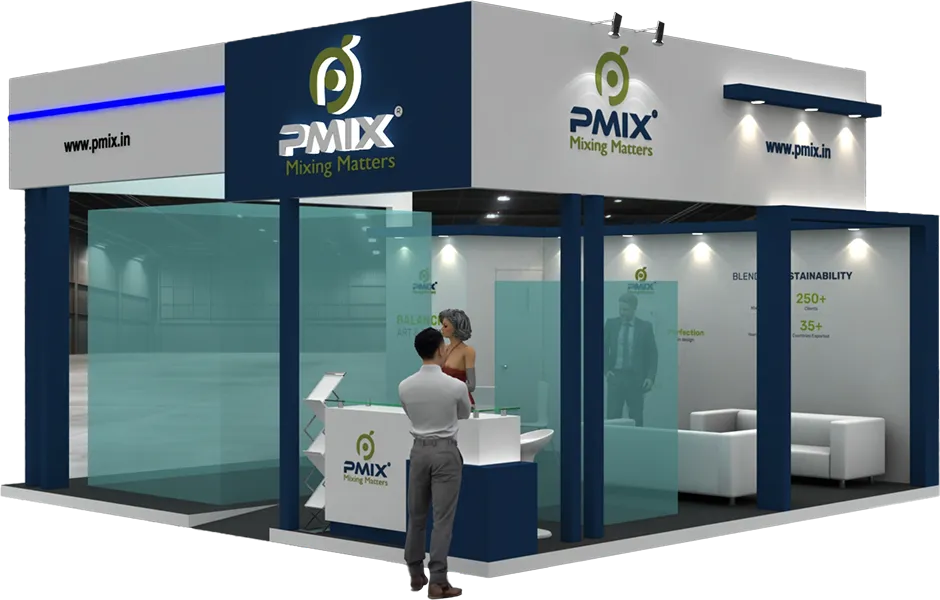
Mix 08: Exhibition Stall Design
Making the Brand Impossible to Miss
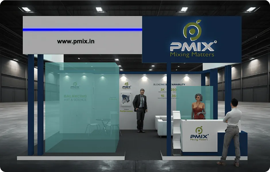
The brand system had to work beyond screens and pages. It had to hold its presence in a physical space. We translated the PMIX visual language into an exhibition stall designed to draw attention, organize the visitor journey and make the brand easy to understand briefly. From the overall structure to product zones, graphics and visitor-facing communication, every element worked as part of the same system.
Mix 09: Collaterals
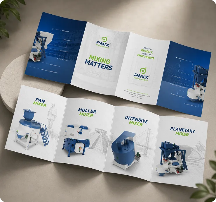
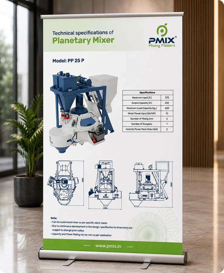
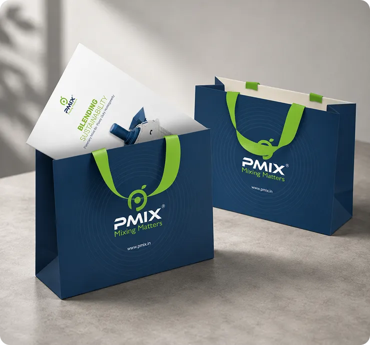
A Physical Extension of the PMIX Experience
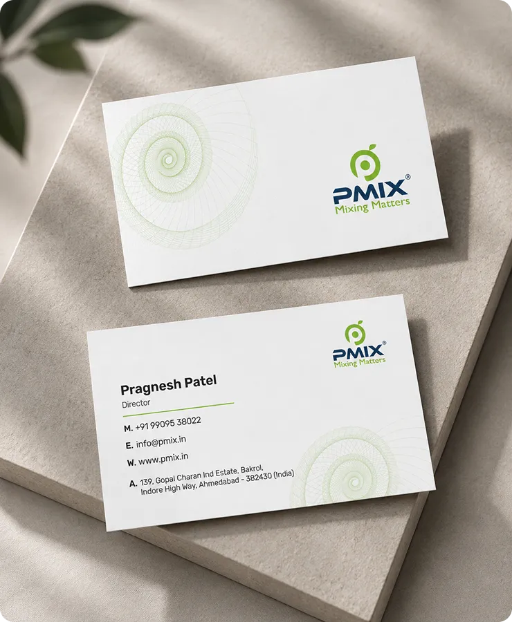
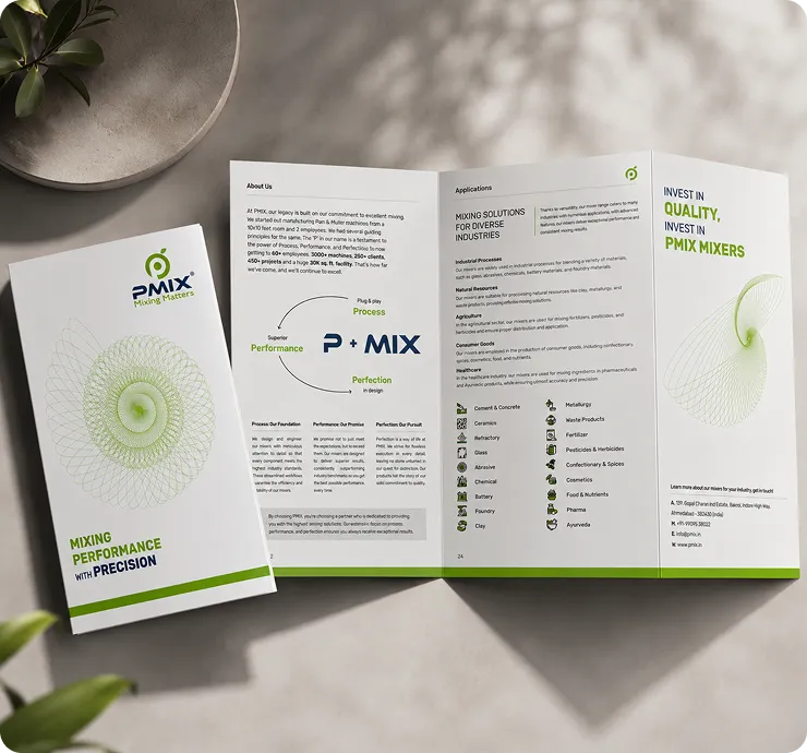
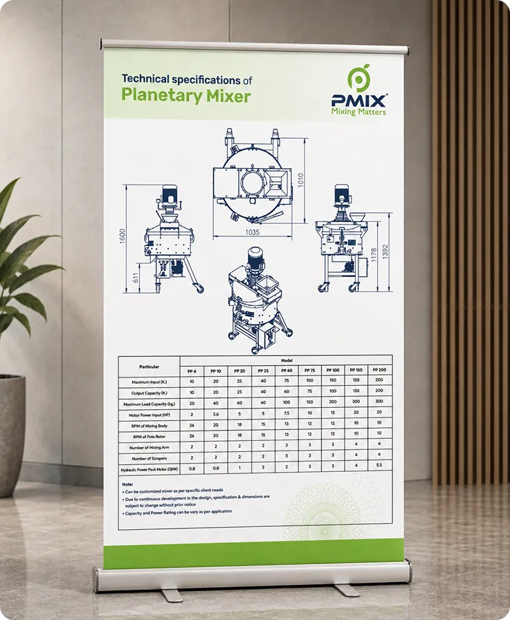
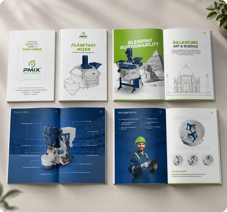
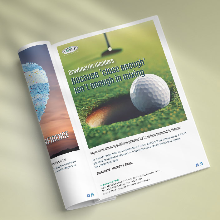
PMIX had a lot to communicate, from its products and capabilities to the details that matter to an industry audience.We translated that information into a structured collateral system by using clear hierarchy, purposeful layouts and consistent visual language.The result was communication that could carry technical information without making the reader work too hard to find what mattered.
Mix 10:Website Design & Development
Bringing the PMIX Experience Online
The website became the digital extension of the PMIX experience that carried the same visual language into a space where visitors could take their time, explore the brand and understand its offerings in more detail.
We designed and developed the website around clear navigation, structured content and strong product presentation by making technical information easier to explore without losing the visual character established across the brand.
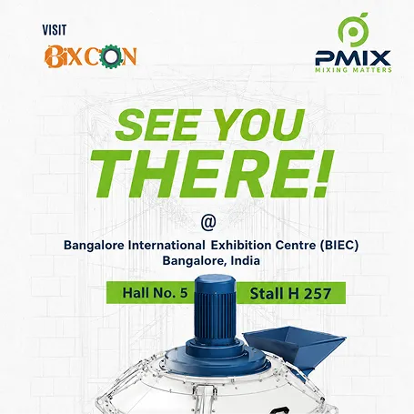
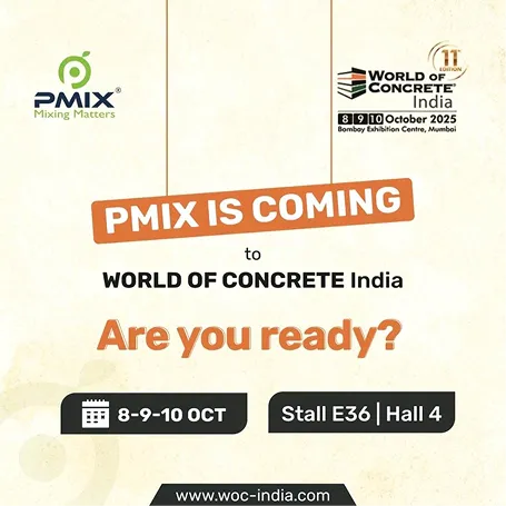
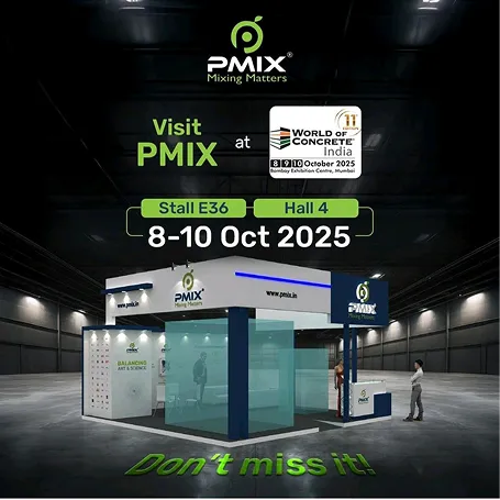
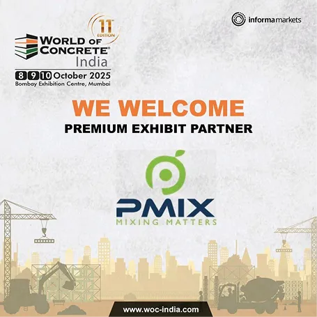
Mix 11: Social Media
Keeping the Brand in Feed
The visual language created for PMIX did not stop with the exhibition or website.
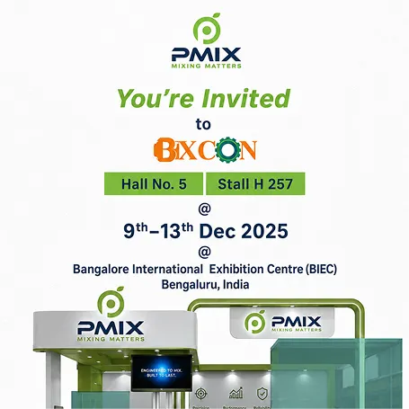
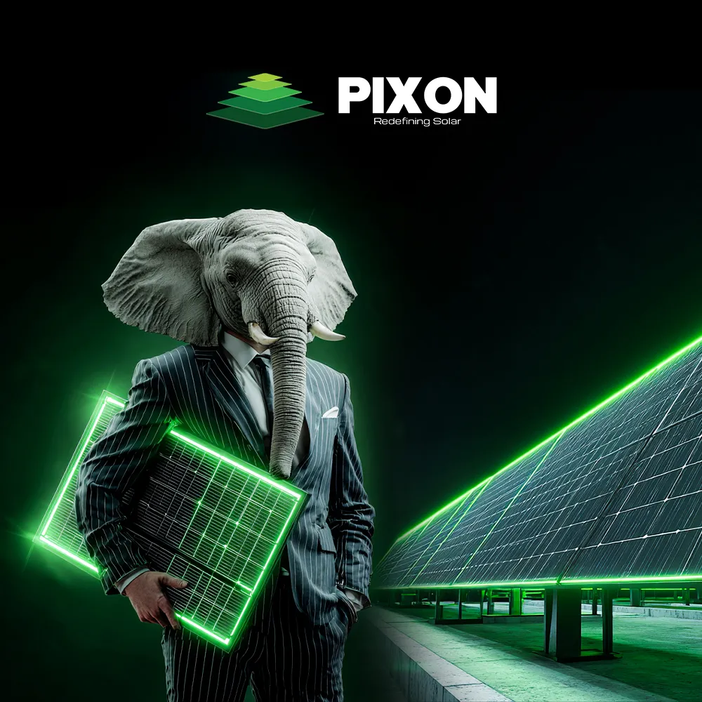
We carried the same design language, product communication and brand cues into social media. This created a consistent presence that kept PMIX recognizable across its everyday digital communication.
Each piece worked within the larger PMIX system from product-led posts to brand communication.
MIX 12: The Outcome
The Brand became Easier to Recognize
CONSISTENCY
One visual language across every touchpoint.
PRESENCE
A stronger and more distinctive exhibition experience.
CLARITY
Product and company information structured for easier understanding.
CONTINUITY
The same PMIX identity carried from stall to collateral, website and social media.
Got a Brand that Needs to Mix Up Everywhere?
We’ll help mix it up from concept to every touchpoint.
Talk to Granth

 Chat
Chat