- August 18, 2020
Importance of typography in Brand making procedure (2022)
6 minutes to read
6 minutes to read
Typography is as important for a brand as a bridal dress is for a bride or a face is important to recognize a human being. It is not an exaggeration. Typography, if not done the right way can make readers feel uninterested, troubled, or even disgusted. Bad typography can make your project look amateurish and have less value. It may sometimes even contradict your message and may give a very wrong impression to the reader. That’s why it is crucial to get typography right because with good typography your brand can shine in the market.
Typography is the body of your brand making, it is a crucial part of the design you are using for your brand making procedure. It appeals to readers as it can evoke a mood or feeling in them. It also adds layers of meaning, sometimes so accurately that readers can get meaning just by looking at typography before they read it. Typography will be everywhere from visiting cards to the newsletter of your brand. An appropriate and consistent typography can make your brand look professional. Thus, the importance of typography cannot be denied.
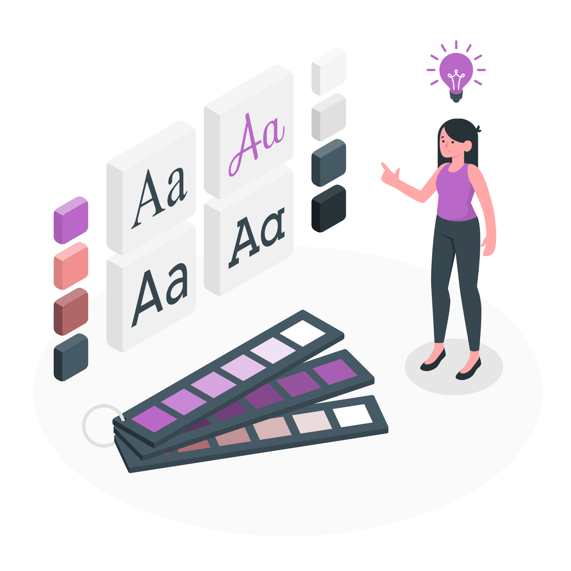
In simplest terms, typography can be defined as ‘A skill or art of choosing and arranging fonts of content in terms of typefaces, colors, size, margins, alignments, etc. to communicate a message as effectively as possible.’
Let’s break it in understandable pieces. First of all, it is a skill of choosing and arranging content. Content of all lengths has different requirements. Secondly, we have to arrange fonts accordingly. Parameters for arranging are important terms of typographical design. We will talk about them in detail below but remember that each element has reasoning and connotations of its own.
Typography as a design has a philosophy. It is crucial to understand typography’s meaning. It aims at the clearest form of expression when typefaces and design can be part of the message. It also has conventions regarding font faces and colors. It is much needed to know them beforehand.
There are mainly two types of typographical font faces. Serif fonts are fonts that have a serif, a stroke, or line attached to the end of letters. ‘Times New Roman’ is a perfect example of a serif font. Sans serif is the fonts where such strokes are not used. Arial is a sans serif font. Serif font looks elegant and old while sans serif fonts look plain and modern. Your branding will always have one of these basic meanings and you should choose the font face according to it. Within each type, you will find verities to try with the message you are trying to give.
Typography design is also about the mood and tone of the message. The design of a typeface can invoke certain moods. You can choose one which is complementary to your message. It will help readers understand the message accurately. The tone of the typeface is determined by the shape and curves it takes up. ‘Ink Free’ fonts may look casual while ‘Bahn-schrift’ may look serious in tone.
Typography as a design tool has various elements. Let’s check them one by one.
We talked about the typographical font face, it determines how your font looks. Font faces should be chosen according to what your brand is about. Take the example of Nike where sans serif fonts are used to give it a modern feel and they are slanted towards the right to give the impression of ‘progress’. Amazon in its logo uses curvy font faces and creates an impression of a smile through the arrow below it.
Font size is important when there are different kinds of information in one space. A bigger size means more emphasis. Titles or headings are bigger than fonts in the body. Take this article as an example, Title is in the biggest fonts, headings are smaller than it but still large enough to get readers’ attention.
Colors have meaning. Red means power or love, blue means trust, pink means tenderness, etc. Meaning of color differs in every culture so it is advisable to research it before using them. Most of the time black, white, blue, and red are used in combination.
Alignment is the overall feel of your typography. It determines how much space you give to content and how much to whitespace in a document. Every web article is aligned justified to be fit in various devices
There are some good examples of typography used by brands in various forms.
Look at this logo of Virgin mobiles. It has typography including letters crossing their standard proportion, which stands for the reach of the network everywhere.
Skype, the video conferencing service by Microsoft used to have a sans serif font face with rounded edges. The prominent feature was the bubble-shaped background which was ‘friendly’ in the eyes of the audience. Once it gained popularity it changed typography design to a standard Microsoft font face.
Apple also has used sans serif font face named Helvetica Neue, which was recently replaced by a San Francisco font face as it has launched products using small screens.
YouTube uses Trade Gothic LT, which is condensed. That makes it great for headlines or titles. It is also sans serif font face representing modern or new.
While making a Brand Guide book, Typography becomes crucial because it is the most used element in it. Pictures, logos, tables, and graphics are part of it but information is written in it. The brand guidebook should be a mirror of your work culture and style. Choose a typeface that should be consistent. Choose different fonts for titles, headings, and body texts. Serif fonts are good for titles and sans serif fonts are good for the body. Don’t use more than two or three fonts, instead experiment with size and color. Always remember, typography can make your brand typical or can lift it to the top in marketing.
If you want to learn how to use typography at its best, here is a short course for it. Join it today!
At the end of the day, it all comes down to how you present your content in a creative way and the way people grab information from it. Are you stuck in your design evaluation process? Need help? Brand Bucket is here to take any challenges!
Connect Now 1")