- January 11, 2023
The nuances of Color Psychology in the world of Branding and Marketing
8 minutes to read

Do you recall ever stepping into a room painted yellow and feeling warmth or glancing at a blue artwork and feeling at peace? No, you do not imagine it because colors set the mood and tone.
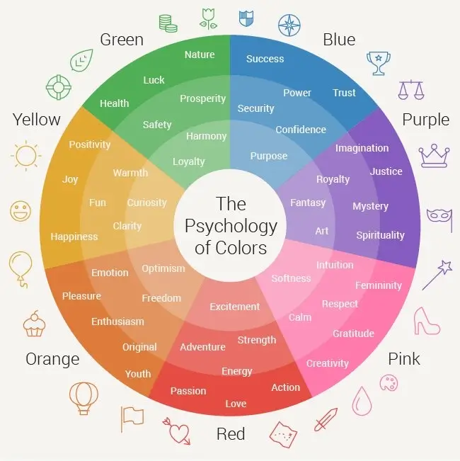
Colour psychology studies show that each unique hue can elicit emotions. Colour isn’t just for painting; varied tones may be used to create the tone for a brand’s style and even to build brand awareness! The study of how colours influence perceptions and actions are known as colour psychology. Colour psychology in marketing and branding is concerned with how colours affect consumers’ perceptions of a brand and whether or not they influence consumers to think about particular brands or make purchases.

Effective marketing aims to establish an immediate connection with an audience and build brand awareness and loyalty immediately. Colour psychology plays a significant influence in this!
While a great logo and a well-chosen company name can help clients connect, the colours used to bring the logo, commercials, websites, and other marketing tools to life communicate a subtle yet significant message. Customers are already forming judgements about a brand’s style and tone based on the colours used without even realizing it. This is an opportunity for brands to connect with their audiences and encourage them to act through strategic colour placement and combinations.
Understanding the psychology of specific colours can help you grow audiences and potentially drive purchases. One or more primary colours can be employed to represent the brand’s overall characteristics. Furthermore, secondary colours can elicit even more emotion or prompt action, such as emphasizing a button on a website encouraging new consumers to join a mailing list!
It’s a crucial area of study to take into account while developing marketing materials, starting a new company, or rebranding an existing one. Researchers discovered that up to 90% of quick judgements made about products can be based just on colour, a study titled “Impact of Color on Marketing.” Every facet of branding and advertising involves colour. No matter if it’s your logo, the label on your goods, marketing materials, commercials, etc. One key element that gives a brand individuality and aid in positioning is colour. A customer is sent a silent message through colour.
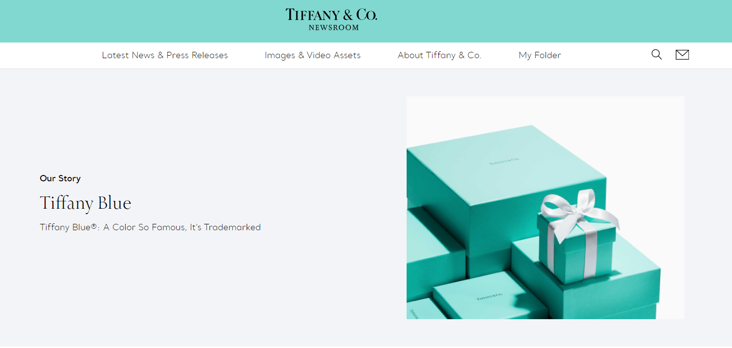
By trademarking the hue utilized in branding their goods and services, brands have taken things a step further. The blue of Tiffany & Co. would serve as one such illustration. People all across the world covet their jewellery as well as the box it comes in. Talk about iconic!

Are you planning to build your company’s website or design your dream logo? Sure, go ahead and do it. But have you considered colours? We are confident you have. Do the colours, on the other hand, highlight your brand’s personality? Do they set you apart from your competitors? If you have yet to think about them, you should consider them before developing your website, logo, or packaging.
If your business is represented by a particular colour, customers will presume it has certain qualities. The truth is, not everyone will share these presumptions. Depending on their own experiences, history, upbringing, culture, religion, etc., each person has a unique view of many colours. Nevertheless, because of globalization, specific colours are seen to have particular characteristics that can be employed to establish a brand’s personality.
The answer to the question “What colours are perfect for my brand?” is always “It depends,” even if it would be lovely to be able to make the right choice by looking at an infographic. Although it is a discouraging response, it is the reality. The truth is that there are no precise rules for picking colours for your brand. An essential factor to take into account is the environment in which you work. What matters is the emotion, tone, and impression that your brand or product evokes.
The good news is that understanding colour psychology will enable you to make the best decision.
Researchers discovered in a 2006 study that the perceived suitability of the hue being utilized for the specific brand drives the association between brands and colour. Or, to put it another way: Does the colour match what’s being sold?
According to studies, predicting how consumers will react to a colour’s suitability is significantly more crucial than the colour when choosing the “correct” shade. Therefore, while choosing colours for your marketing and branding, ask yourself, “Is this colour acceptable for what I’m selling?” or, even better, gather client feedback.
Using colour psychology in marketing can assist your company in sending a message or evoking emotion. Certain colours used in specific areas of your website, social media images, and other marketing materials stimulate your clients to act or drive interaction. However, the placement of these hues is as significant.
Choosing bright, dramatic colours like yellow or red for action buttons, for example, can help increase clicks. White backdrops with contrasting dark tones, such as black, can bring attention to specific characteristics, such as your logo. Color’s impact on business is maximized by combining positioning with your choice of hues.
1. If your target market associates your brand with a colour, be sure it is consistent worldwide. Because of this, maintaining colour harmony with your branding is crucial, and the most successful brands understand this. Do you recall when Dunkin Donuts changed its name to Dunkin a few years ago? All those visual modifications with the same recognizable colour schemes. One could still easily recognize the brand even though there was a difference in names.
2. Before even going into specific colours, there is a wide variation in colour categories, with some brands having just three and others having up to 12.
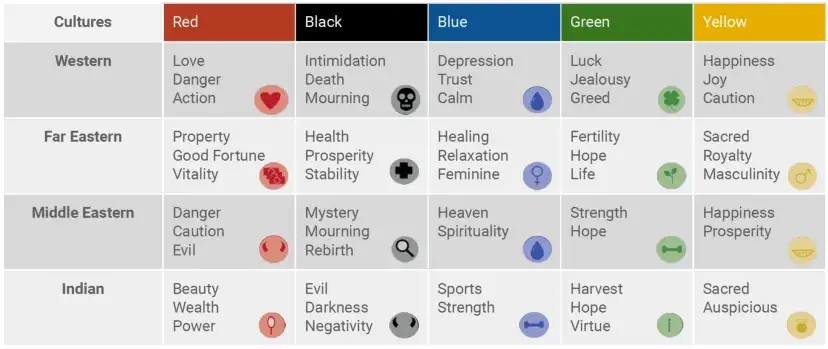
3. It follows that only some people share the same perceptions of colour. Because of this, it’s critical to consider cultural context while developing your branding and marketing. Here is an excellent visual cheat sheet to use as a starting point:

4. Don’t panic if you’ve reached this point and are thinking that keeping note of cultural context, sticking to a palette, and relying on colour psychology foundations is overwhelming and unachievable. Learning the fundamentals of colour psychology and applying it into your marketing strategy will necessitate some effort and time. Blue is probably the most popular color on the planet. That could be one of the reasons why blue appears in the logos of some of the most influential firms. Facebook, Oreo, Twitter, PepsiCo, Skype are just a few examples. Blue is probably the most popular color on the planet. That could be one of the reasons why blue appears in the logos of some of the most influential firms. Facebook, Oreo, Twitter, PepsiCo, Skype are just a few examples.

5. You can’t always predict how your audience will respond to a particular colour—let alone certain shades, tones, or tints in your colour palette. That’s where A/B testing comes in. Use different backgrounds in your adverts or buttons on your website to evaluate which ones your audience favors. The key is to keep testing and reviewing until you find the one.
6. Colors are essential in increasing brand awareness. If you are a new business, you should use colours that set you apart from your competition. Customers always choose brands they recognize, so you must initially entice customers with your colours before telling them what sets you apart from the competition.
Colour is crucial to marketing. Colour psychology may help you maximize the subconscious effects of your marketing efforts, from picking a tone to make your logo pop to utilizing the perfect hue to generate brand recognition and loyalty and motivate action. These basics will help you stay on track to find the right colours for your brand representation. Granth follows these essentials and many more for their clients. We ensure that with the right colors, designs and words, your brand speaks with the audience and attracts great number of customers.

The above image is a snapshot of our Instagram page; almost every post may, it be a case study, festival post, employee anniversary or birthday, witty copies, memes, are created with Granth’s template in the backdrop. Even without seeing the page from which the post has been uploaded, our viewers are able to recognize the brand easily.
Choosing the proper brand colours that are in line with your brand’s vision and values will help you stand out from the crowd. Furthermore, it might assist your intended audience in seeing exactly what you want them to view. Colour psychology is essential for marketers and designers since it plays a role in marketing and branding. Colour psychology may help businesses build brand identification and increase conversion rates. Granth has been able to deliver to its clients, enhanced customer engagement by employing intelligent techniques like colour psychology in branding and marketing. Hop on aboard with us, and let’s grow your brand!