- May 8, 2021
Convert Fast | 10 Website Design Principles to Follow
9 minutes to read

So, you have designed a wireframe, you have planned the content you are going to input on your website, you have even developed a social media strategy for your website, but what about the website design? Is your website design in place? Have you ever considered how much time you can save with proper research on your website design?
These are the questions that we will answer with our blog today.
Designing a website isn’t an easy task, as claimed by many experts. It is something that requires hours and days of research and getting the right content such that you get the reach that you expect from your target audience. Research says that over 94% of first impressions are influenced by the design of your website.
In the world of the world wide web, websites have become one of the most commonly used platforms for enterprises to showcases their products and services. Most of the businesses today are dependent on the quality of websites since websites have become the front face for them online.
There is not a single aspect about designing that can be left unattended, and it demands more than just hard work but also smart work. It is critical that the site you have built creates a solid first impression on your prospects.
Do you know? That over 75% of credibility comes from your website design? Building trust among your potential stakeholders such as prospects, clients, and customers isn’t an easy task, and for trustworthiness and credibility, all the aspects, from designing the visuals to framing its usability and utility.
For that to happen, they must be visually appealing and be able to provide the user a remarkable first-time interaction experience.
These are some of the tips that you can follow in order to deliver in terms of website design:
Content is the key. It should be one of your topmost priority points to cater to when it comes to websites because it is responsible for attracting or repelling people from your site.
If your copy is well-tailored with carefully crafted CTAs and power words, then you are bound to get repeating visitors. And if the copy is badly drafted with poor content, then you can lose a huge chunk of visitors.
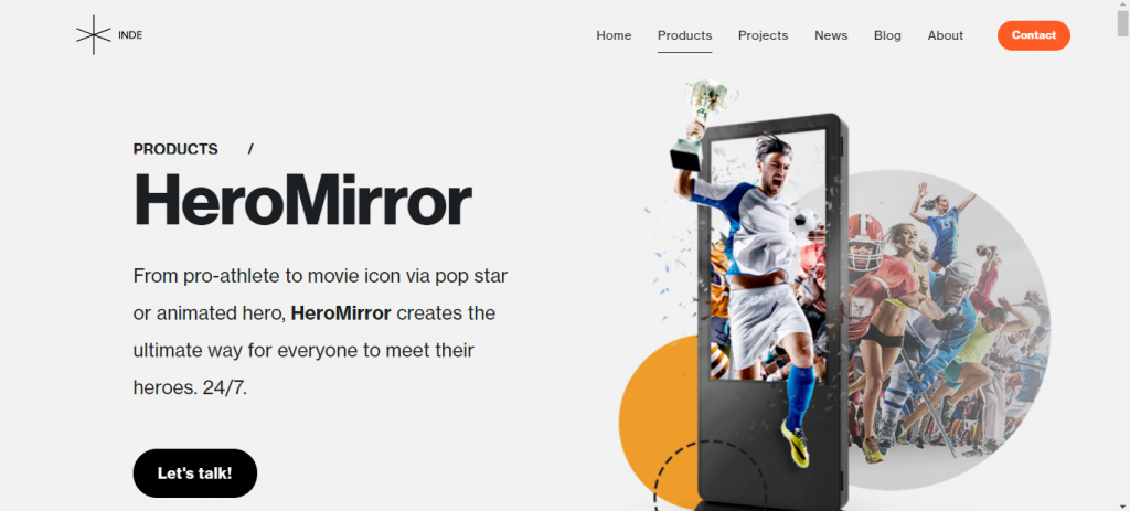
A study suggests that at least 38% of visitors stop engaging with your site if it has unappealing or uninteresting content. It is also quite essential to keep the language of the content in check. Too many jargons, highly sophisticated text, old content that is irrelevant are some of the aspects that you should look out for.
About 89% of users prefer visiting a competitor’s site if they don’t find the content that they are looking for in a website.
It is imperative that the images, graphics, icons, and other forms of visuals that you use match describe the content placed in your website.
It is not only unappealing but also confusing for a visitor if the image placed on your site says one thing, and the content says other.
Visuals play an essential role in describing the content since most of the people who visit may prefer graphics and images for understanding the content better over reading the text.
Of course, the text is an essential aspect of content but so are visuals. And together in synchronicity, they do the job of retaining readers and making more conversions. Have you heard of the saying a picture is worth a thousand words? It stands very true here.
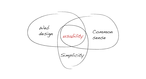
Is your content too exhaustive? Are the visuals too hard to understand? Too many images on one page? If your site checks on all these facets, then you need to simplify your website. This will not only make it more user-friendly but also guarantee you some decent amount of retention.
Keep the design as simple as possible with colors not more than five and fonts not more than three. Don’t forget to experiment with unique designs but keep in mind that you don’t overdo it ruining the whole experience.
There is more you can do with simple designs. You can put more focus on graphics that are appealing, make your webpage seem more spacious, and more.
Website navigation is a factor that is often overlooked when the website is designed. For websites with fewer pages, it is not that much of a difficulty navigating, but what about websites with more pages? In that case, it becomes quite difficult for the user to find the information he is looking for.
That is also the reason why it is also important to keep the website simple in terms of its design, as stated above in the previous tip. There is a photography principle of the rule of thirds, which basically divides the image vertically and horizontally in thirds, giving you nine equal sectors.
According to this principle, the most attractive position is the middle position where most of the user’s attention is active. You can follow this principle to place objects and content on your webpage.
If you want to leave a mark among your visitors, it is recommended to use high-resolution images. An intriguing factor about them is that they provide crystal-clear quality irrespective of the device your website is viewed on. Low-quality images are a downer and they move the visitors away from the site.
Research says that you can retain up to 94% more views if your site consists of high-quality images that draw more attention and have a wow factor. You can avoid using stock images that are too uninteresting and out of date.
There is an alternative to high-resolution images that can sometimes cause an increase in load time for your site, and those are, vectors or PNGs quality of those remain unaffected with stretching.
No matter the effort you have put into aesthetics, text cannot be replaced as the primary reason for people to visit your site since most information on your site is in text.
As you have read above, it is essential that you don’t use more than three fonts for your website. Don’t use any fancy fonts that are difficult to read if you want more visitors to your site and your SEO efforts to give you results.
It is wise to use fonts like Calibri, Sans Serif, Arial, and similar for your body text. If you are looking to experiment with the fonts, make sure that they maintain the overall flow of design and are not too contrasting in nature.

So, you have designed a website that looks wonderful. It has some of the unique features. But what if all of these amazing features become the reason for an increased bounce rate for your site?
The cause of this happening is increased load time that is a result of long coding duration, poorly written code, heavy image sizes, high latency servers, and more.
If you fail to optimize your webpage sizes, then you are bound to face the issue of increased load times. For doing that, you can compress images, upgrade your hosting plan to a better server, and optimize your page scripts.
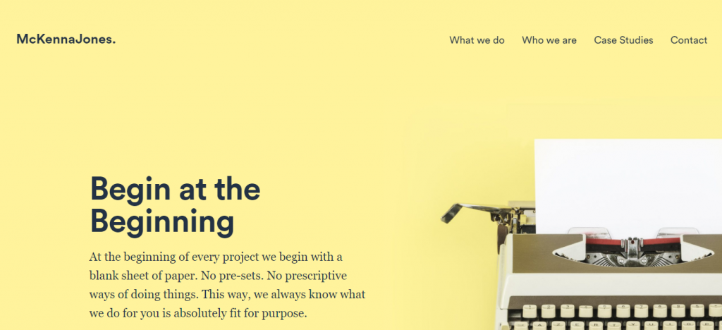
Before you design your website, make sure that you design the wireframe according to the purpose that the website would fulfill. If it is an eCommerce website, design the wireframe accordingly. If it is a website that is made for tourism and travel, then keep it to the point.
To boost the conversion rate, you can use Hick’s law, a theory named after a psychologist William Hick. The theory states that the time taken by an individual to make a decision is directly proportional to the number of choices presented.
Make sure that you cut down the number of choices the user is presented to a minimum to use this law to your advantage.
Colors have the single-handed ability to dictate the mood of your website’s aesthetic. Choosing colors is tricky, but when done right, it can do wonders to your site’s design.
Remember not to pick more than five colors for your website, as stated above. To choose which colors to pick, there is a trick that you can use.
Use any color picking tool (there are a lot of options, including Adobe’s Color Wheel color picker plugins from your web browsers and more) to render a color scheme from an image (super tip: you can use the logo of your brand) and base your website’s aesthetic in that scheme.
One thing that worries users the most is that the site they visit won’t function half as good as it did on the desktop. Many elements are out of the user’s field of view when they are in portrait mode on mobile.
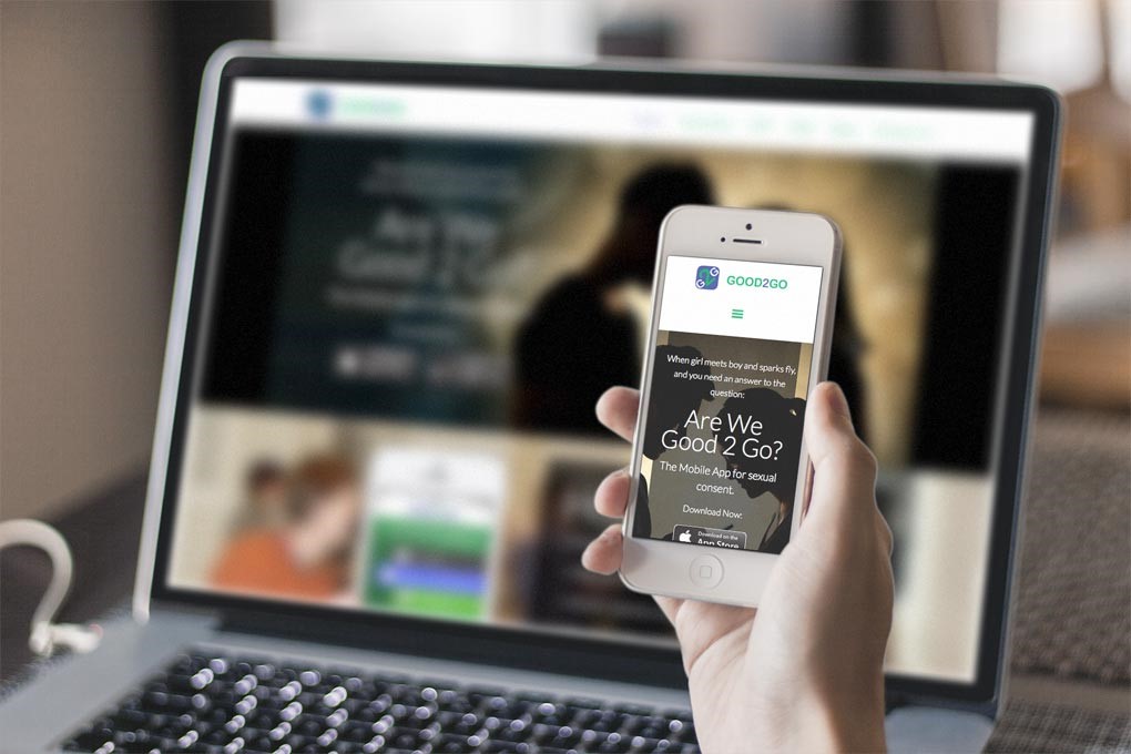
In today’s world, there are growing number of users who visit websites using devices such as phablets, mobile phones, and tablets.
A research report conducted by J Clement found that over 50.81 % of website traffic were mobile users since countries like India, Nigeria, and Ghana heavily rely on mobile devices for internet use. Keep your website accessible to global traffic by optimizing it for mobile devices.
Getting it right takes a lot of effort and sparring time to address some parameters of designing, aesthetics, and user interaction can provide us with many fruitful outcomes in terms of our online presence.
Apart from the above tips, there are some other tips such as proofreading the content of the website from time to time, optimizing it from an SEO perspective, and giving the whole website a test run in terms of load times, runtime, bounce rate, and other factors relating to functionality. Keeping some of the tips above in mind surely can improve the probability of success of our website.
Overall, you’re making a clear statement that you care about the kind of experience users have with your business. And this is the best brand business you convey to them. Let us help in that right step. Brand Bucket – One-stop solution for the UI/UX design with fresh concepts that will match your brand’s vibes.
Connect Now