








- Client ANKA Watches
- Industry Manufacturing
- Engagement 2025*
- Scope 360° Branding & Digital Communication
ANKA Case Study
Bringing the Past into the Present through Watches
ANKA brings history into the present through handcrafted wooden watches featuring authentic historical coins and stamps. We worked across every brand touchpoint, building its identity and shaping how the brand looks, communicates and connects with its audience.
Era 01: The Beginning
The Art of Carrying History
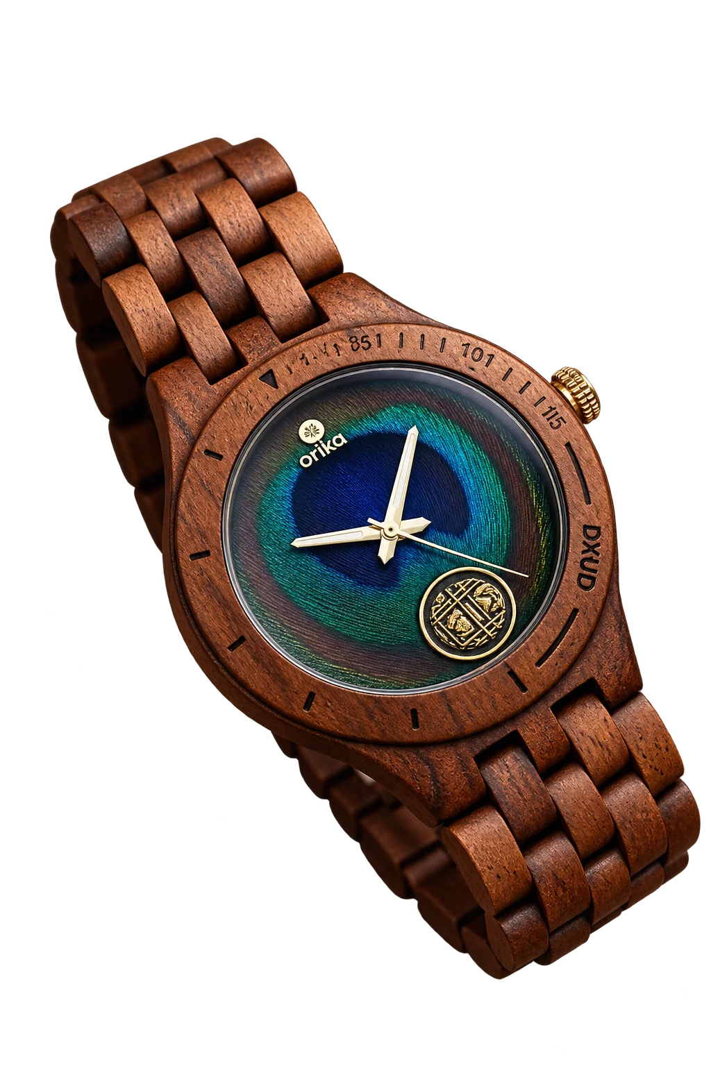
Long before a watch tells the time, it carries a story. ANKA was built around this very thought. What if pieces of history could find a new life in something we wear every day?
With authentic historical coins and stamps set into handcrafted wooden watches, ANKA gave the past a place in the present. Every timepiece had its own character, its own story and a detail worth looking twice at.
We saw an opportunity to build a brand that could do justice to this idea. One that would make people curious about the story behind the watch, even before they discovered how it was made.
The story had its roots in history. Now, it needed an identity to carry it forward.
Era 02: The Identity
An Identity Rooted in Timeless Stories
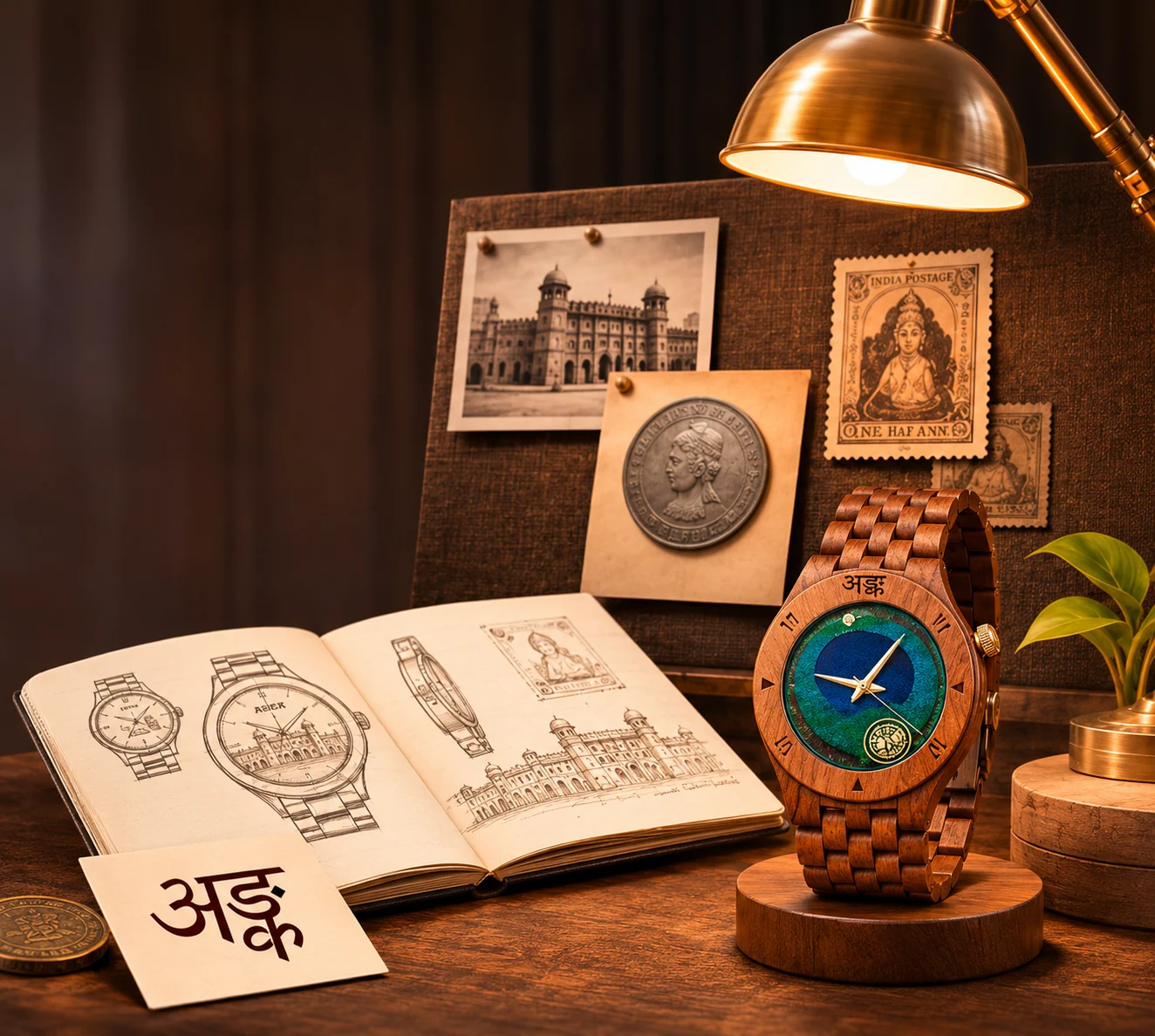
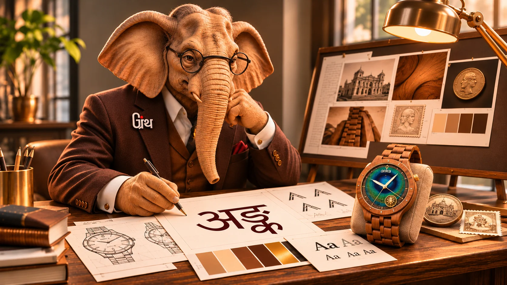
ANKA had a story that set it apart. The identity needed to capture that same sense of history, craftsmanship and individuality. We explored how the brand could look, feel and speak, creating a visual direction that reflected the character of its watches while giving it room to grow across different platforms.
The aim was to make ANKA recognizable even before someone got a closer look at the timepiece.
And at the center of this identity was one mark that would bring it all together.
Era 03: The Mark
The Name behind every Timepiece
A distinctive idea deserves a name that people can remember. ANKA became the name that would represent the brand and everything it stood for. Short, memorable and easy to recognize, it gave the watches a distinct identity and a name that could travel across collections, conversations and markets.
With the name in place, it was time to give ANKA a face.

- WORD
- अङ्क · aṅka
- LANGUAGE
- Sanskrit
- MEANING
- A number; a numeral
- CONNECTION
- The hour on a dial. The year struck on a coin. The value printed on a stamp.
अङ्कः केवलं संख्याः न, स्मृत्याः अनुक्रमः अस्ति
A number is not just a digit, it is a sequence of memories.
THE BRAND'S OWN LINE
Era 04: The Logo
Giving ANKA a Face to Remember
With the name in place, the next step was to give ANKA a visual identity that people could instantly associate with the brand. We worked on the logo, exploring a design direction that reflected its distinctive character and could sit naturally across watch packaging, digital platforms, communication and other brand touchpoints. The identity had to feel at home beside the craftsmanship of the watches while remaining recognizable wherever ANKA appeared.
The logo gave ANKA its face. The guidelines made sure it stayed recognizable everywhere.
WORDMARK · ON BLACK

PRIMARY
DEVANAGARI MARK · ON WALNUT

SECONDARY
Era 05: The Digital Home
Taking the ANKA Experience beyond the Wrist
A watch like ANKA's deserves more than a product listing. Its story, craftsmanship and history needed space to be explored. We designed and developed the website to bring the brand and its collections together in one place, making it easier for visitors to discover the timepieces, understand what makes each one special and explore the details behind the craft.
Once the digital home was ready, the next step was to take ANKA's story to the people.

Era 06: The Social Presence
Giving every Post a Piece of the Brand
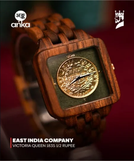
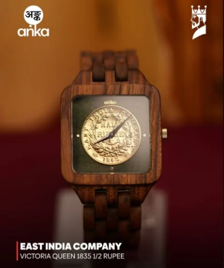
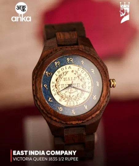
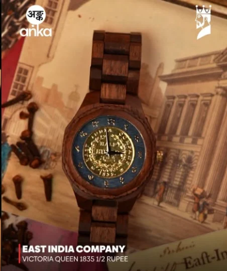
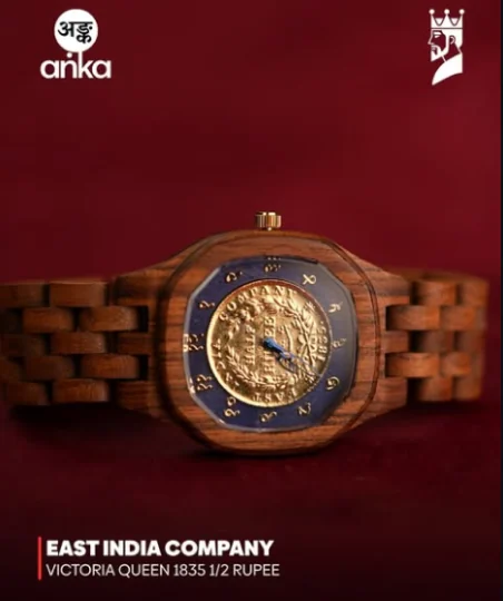
ANKA's story had to travel beyond its website. We built its social media presence around the brand's distinctive watches, highlighting their craftsmanship, historical details and individual character through engaging creatives and content. Every post and visual carried the same identity, helping audiences discover what makes ANKA different.
And for a product with so much character, showing it was just as important as telling its story.
Era 07: The Experience
Every Detail Deserves to be Understood
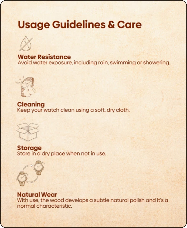
A distinctive timepiece can come with questions of its own. How should it be worn? How should it be handled? How can its unique details be cared for? We created user guide content and a how-to-wear video to help customers understand their ANKA watches and make the most of their experience. The focus was to make product guidance simple, clear and easy to follow, while keeping the brand's visual language intact.
With the brand built across identity, digital and customer touchpoints, it was time to bring it all together in motion.

Era 08: The Motion
Putting the Brand in Motion
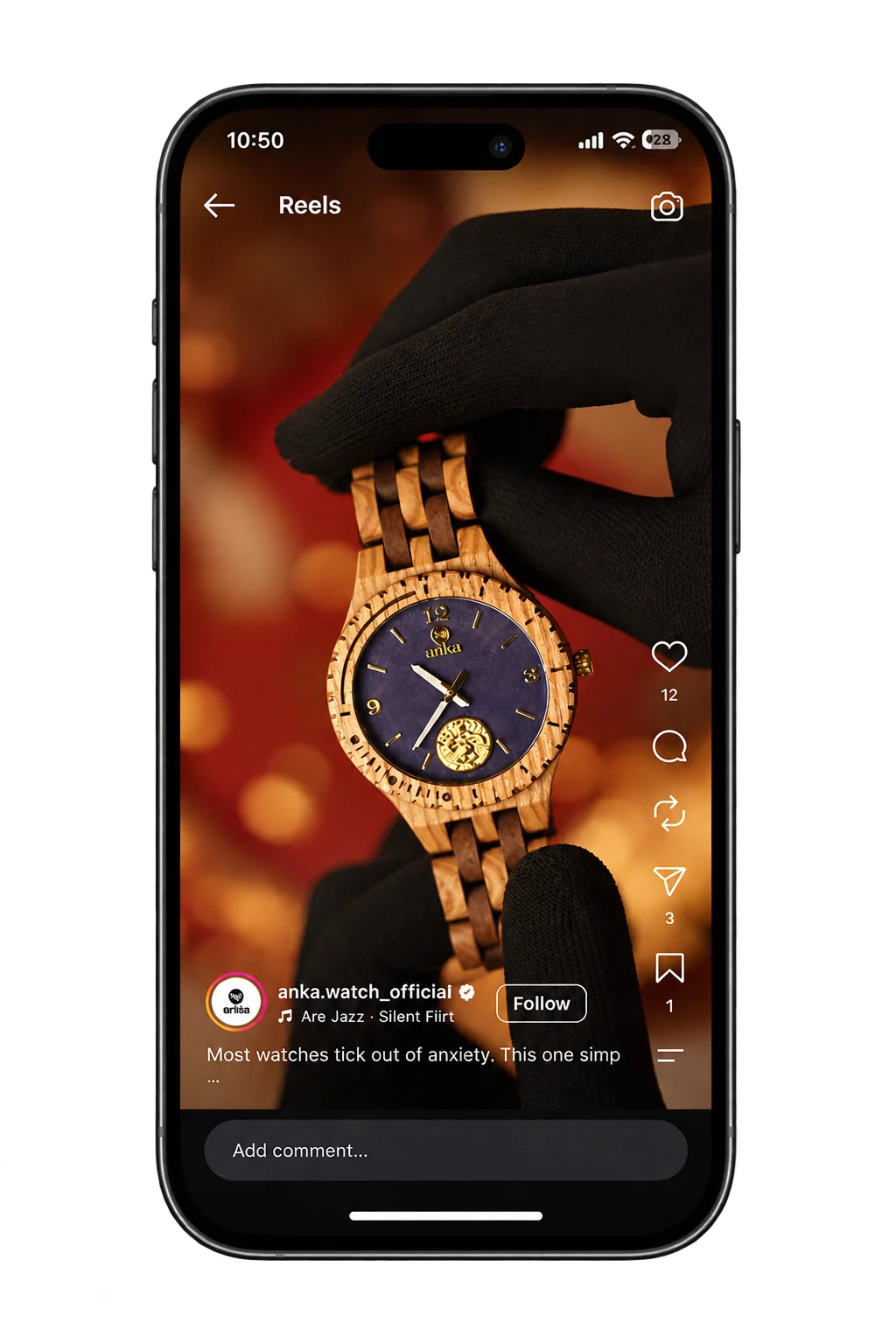
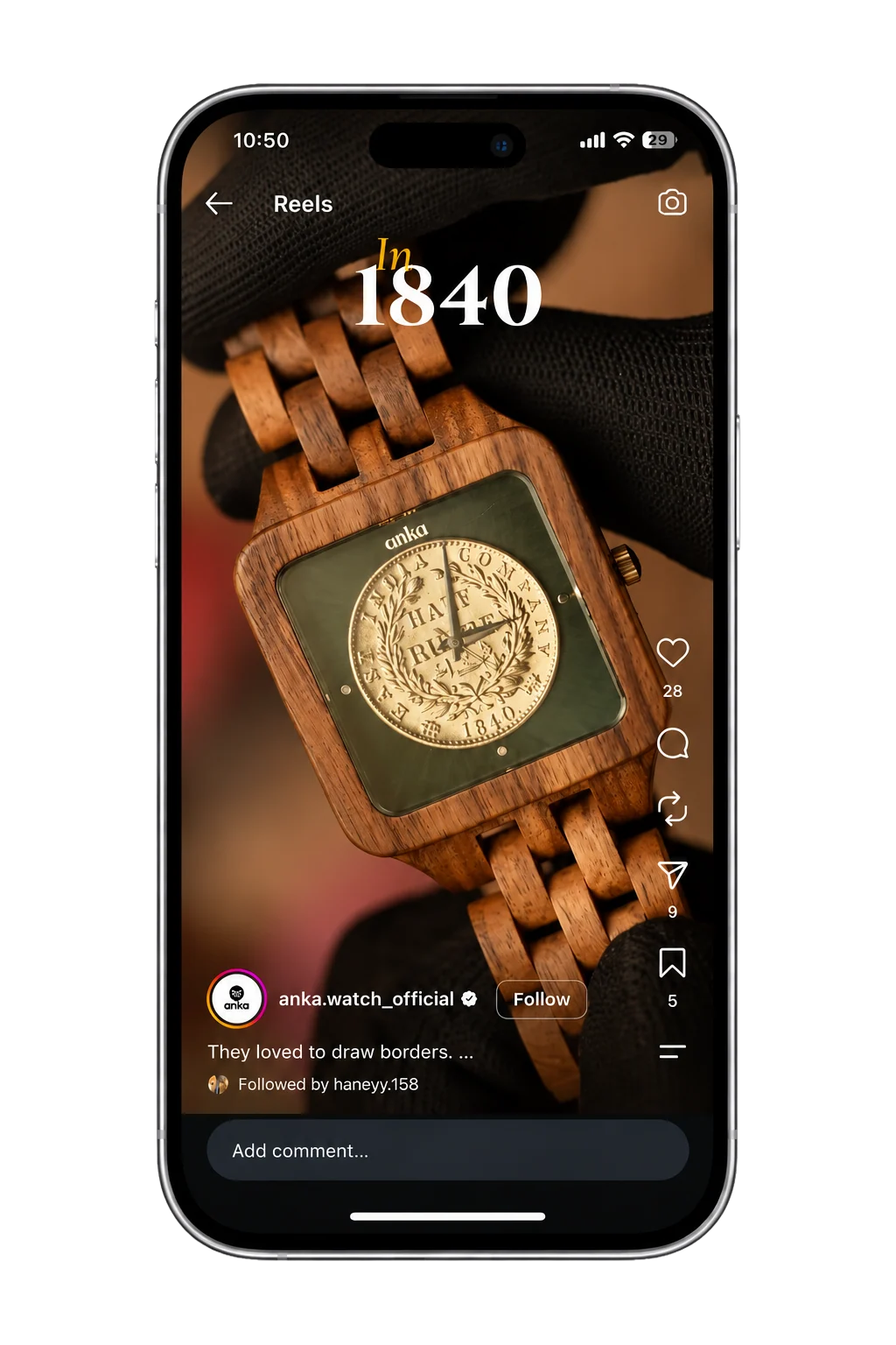
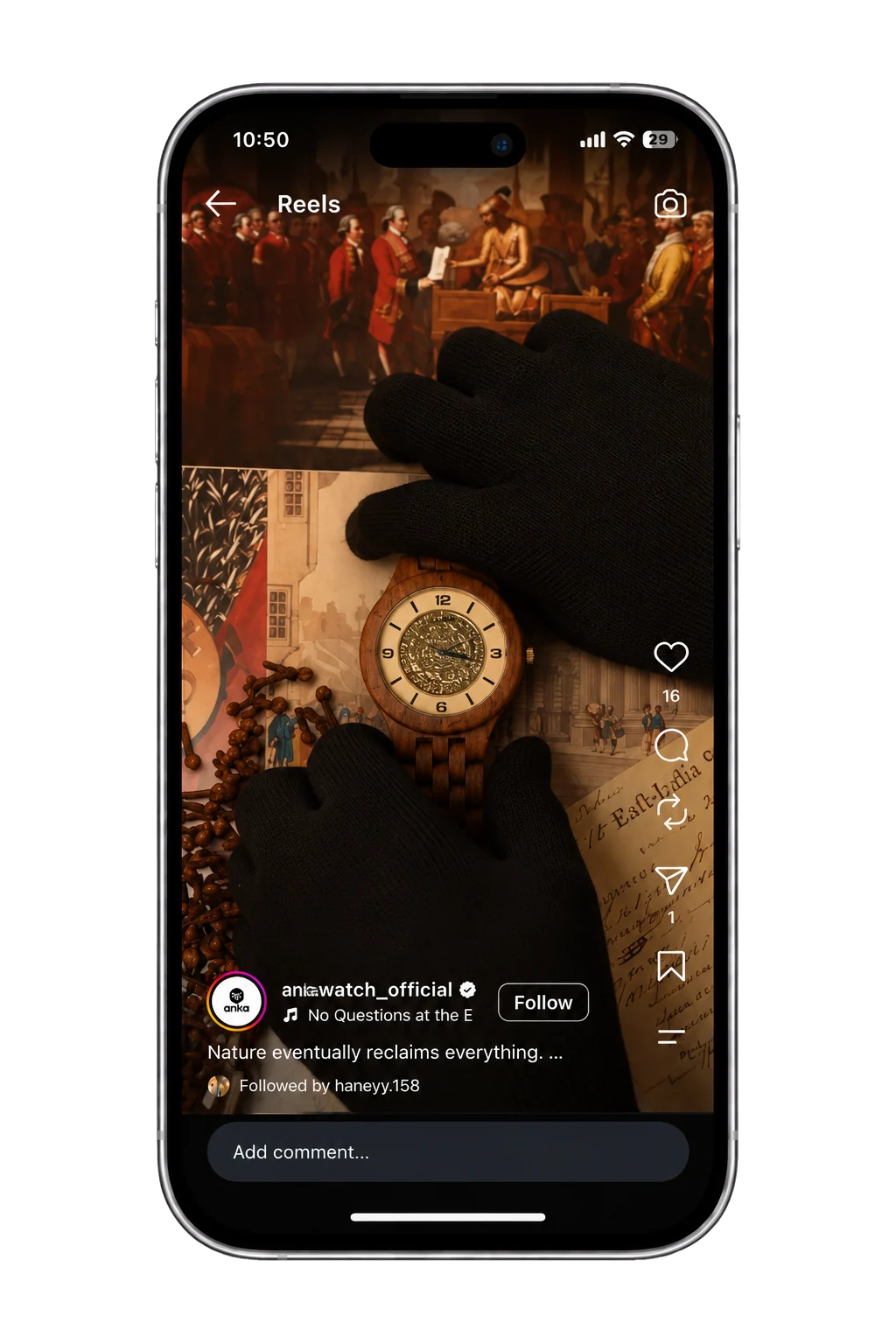
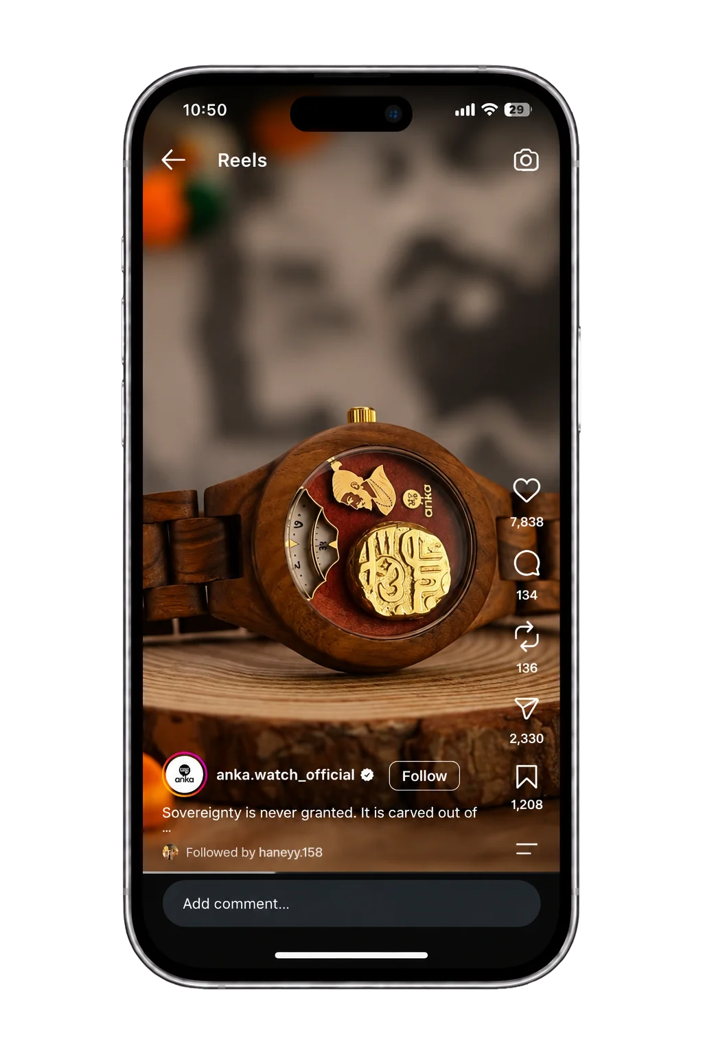
Some details deserve to be seen in motion. The texture of the wood, the character of a historical coin and the craftsmanship behind every timepiece all add to what makes ANKA special. We created reels and video content to bring these details closer to the audience, giving the brand more ways to showcase its watches and tell their stories.
Every timepiece came with its own details. We made those details easier to understand.
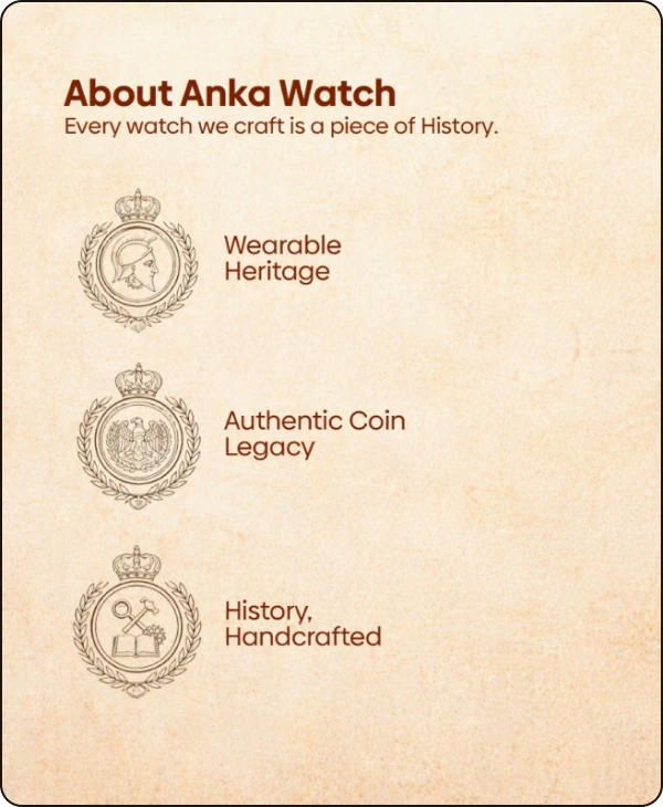
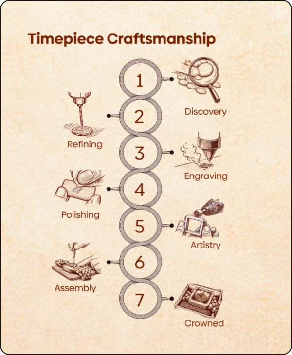
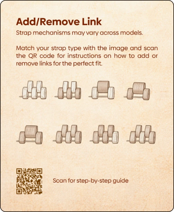
Era 09: The User Guide
A Little Guidance for Every Timepiece
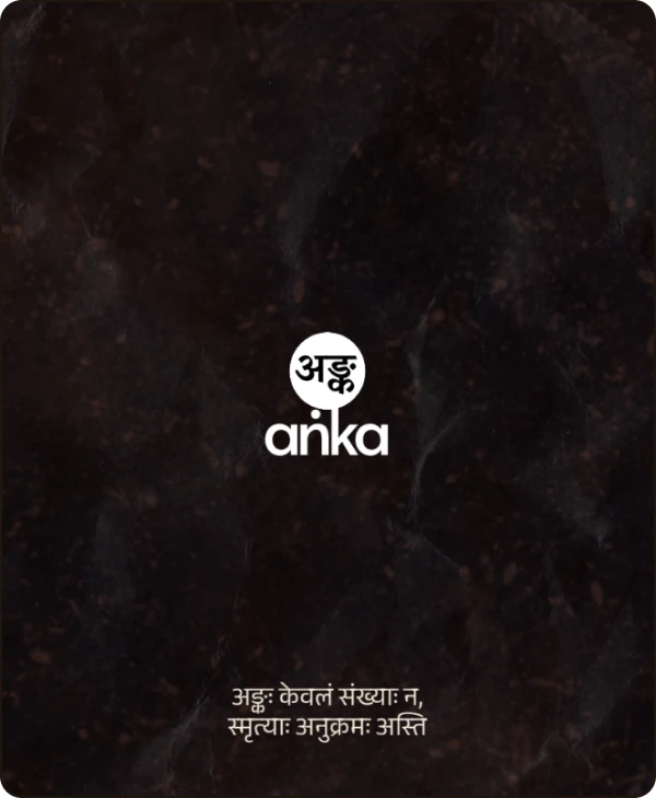
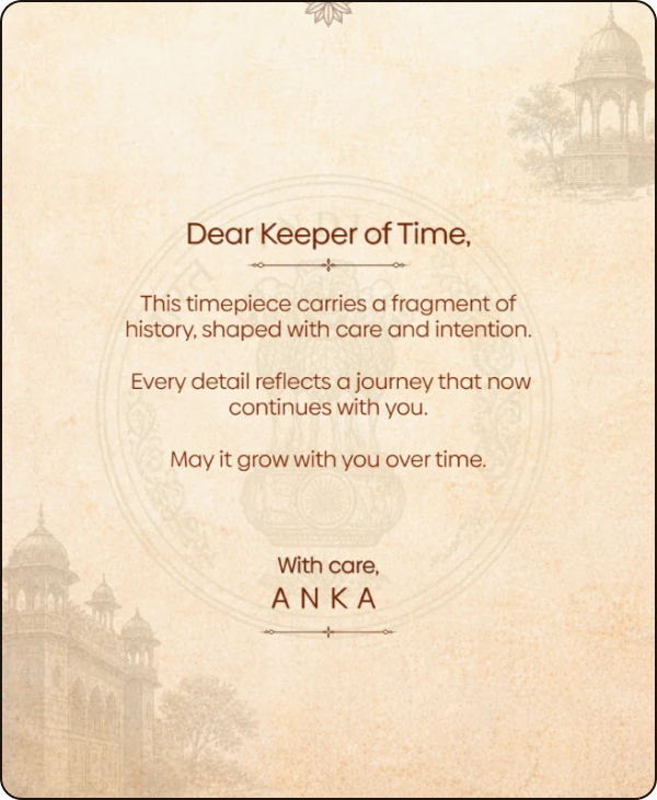
A new timepiece comes with details worth knowing. From understanding its features to learning how to wear and care for it, customers needed the right guidance to make the most of their ANKA watch. We created the user guide to make this information clear, accessible and easy to follow. It brought essential instructions together in a format that customers could refer to whenever they needed, making the ownership experience more informed and convenient.
With the details explained on paper, it was time to capture the watches through our lens.
Era 10: The Photography
Putting Craftsmanship in Focus
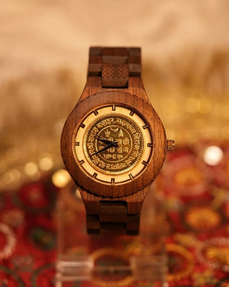
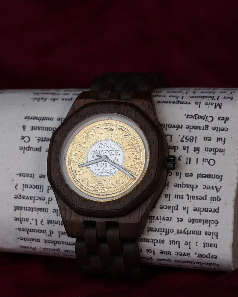
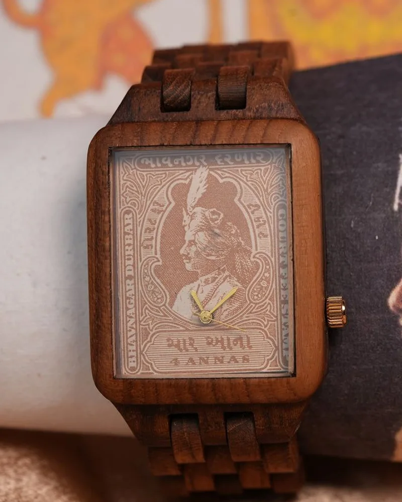
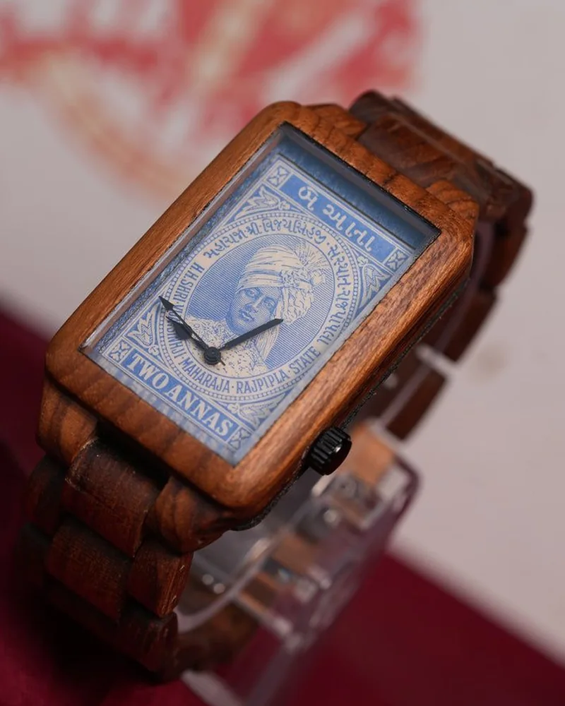
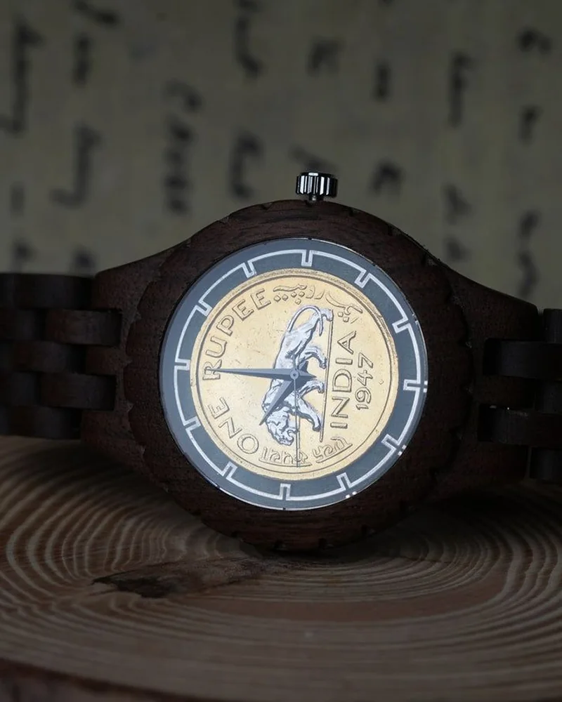
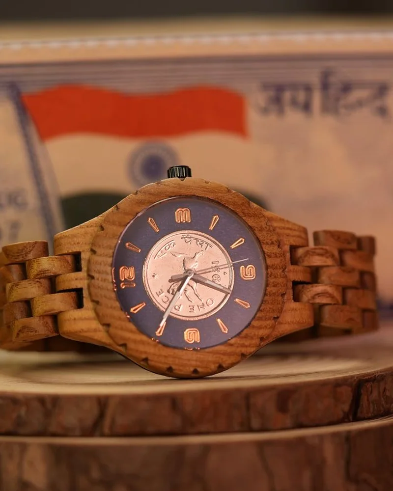
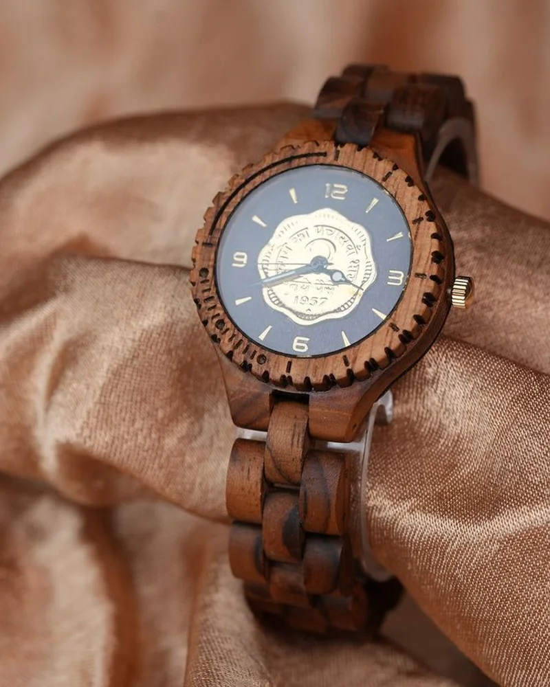
ANKA's watches had details that deserved to be seen up close. The natural texture of wood, the character of historical coins and stamps, and the fine craftsmanship behind each piece all played a part in its appeal. We handled the product photography to capture these details and present the watches in a way that reflected the brand's character. The photographs gave ANKA a strong visual library to use across its website, social media and other brand communication.
From the first idea to the final photograph, every part of the brand came together to tell one ANKA story.
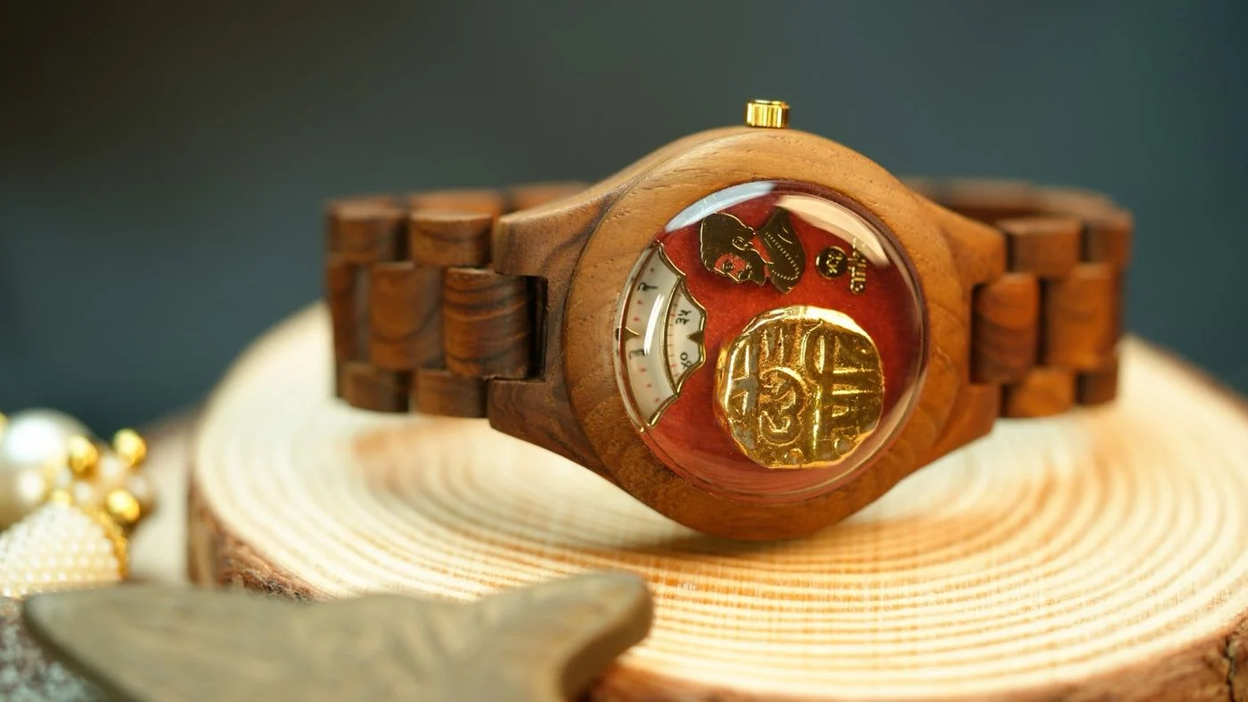
CONTACT SHEET · ANKA PRODUCT SHOOTHOVER TO LOUPE
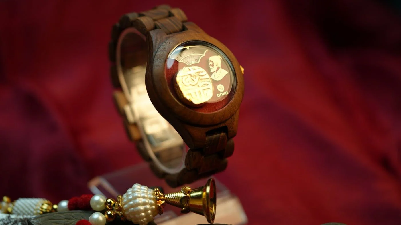
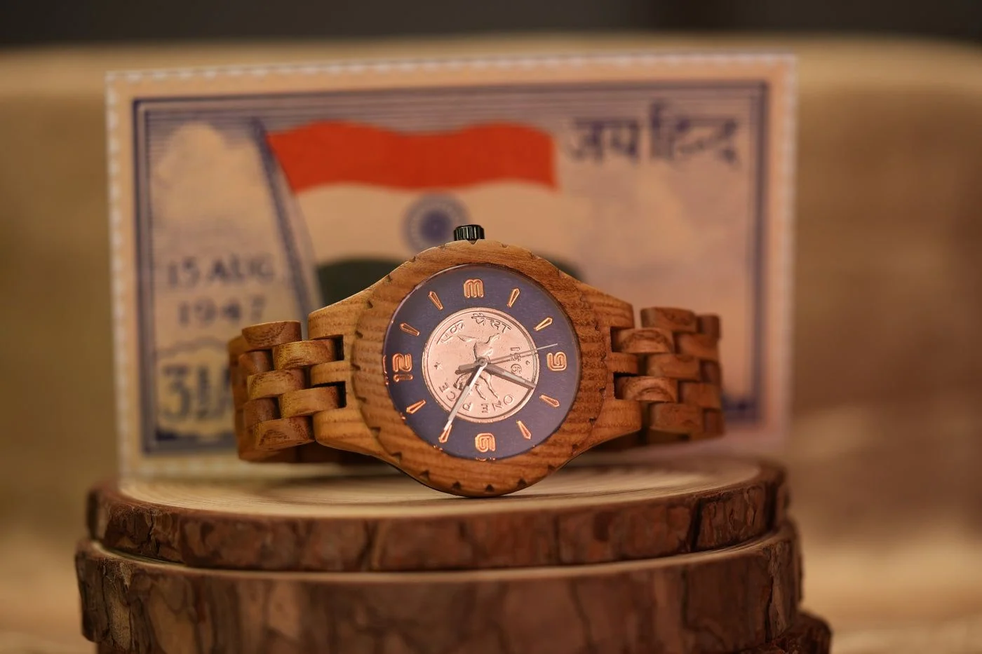
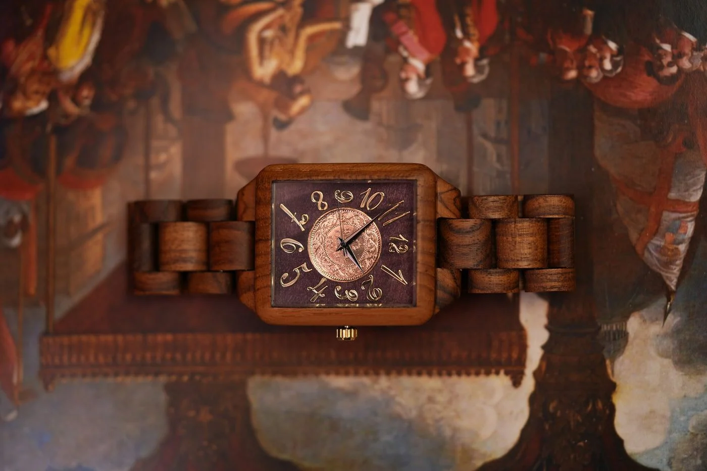
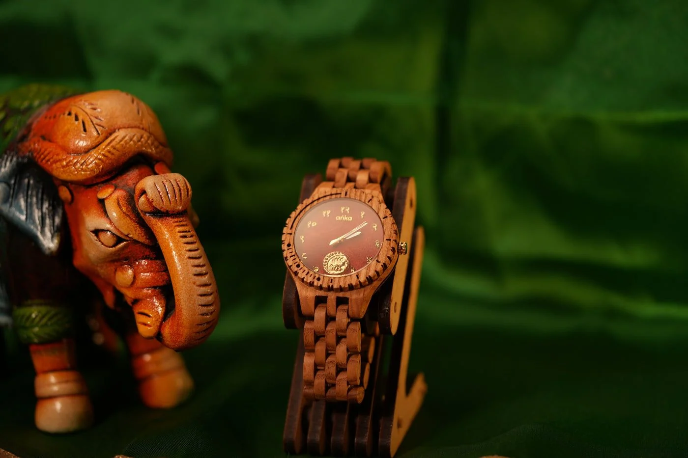
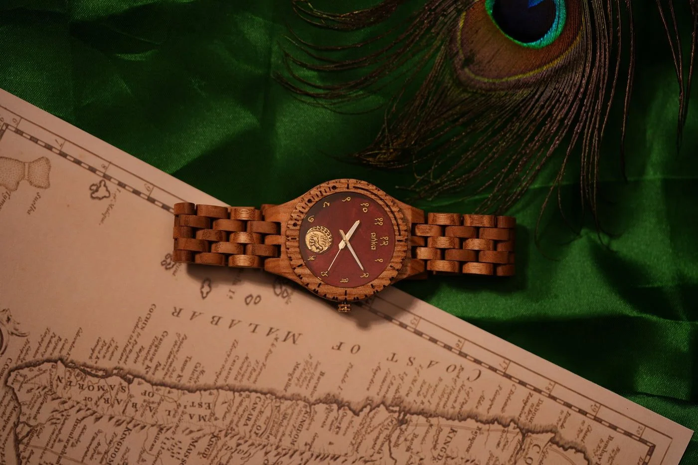
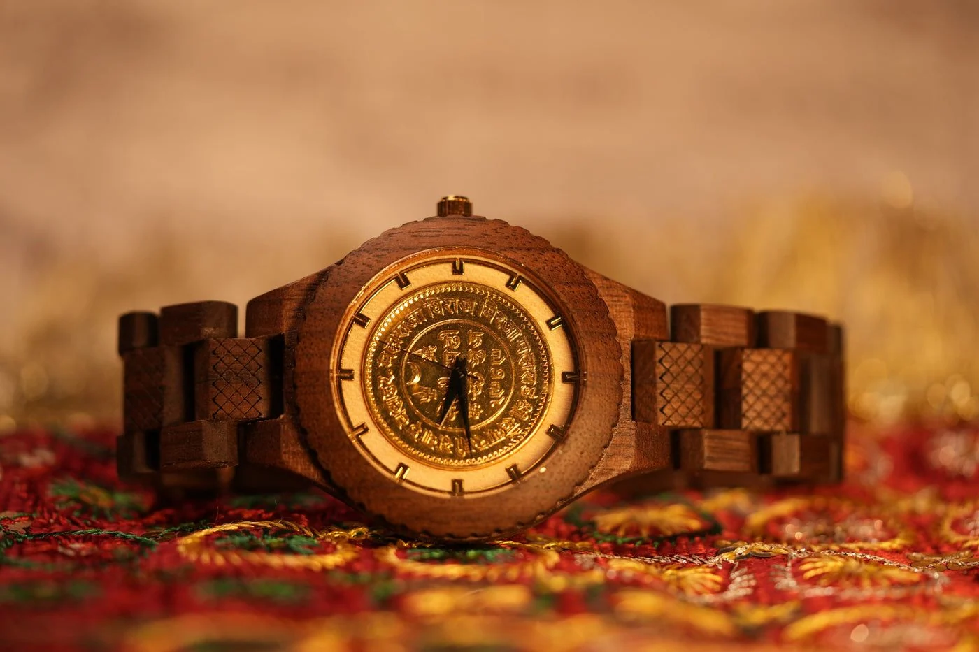
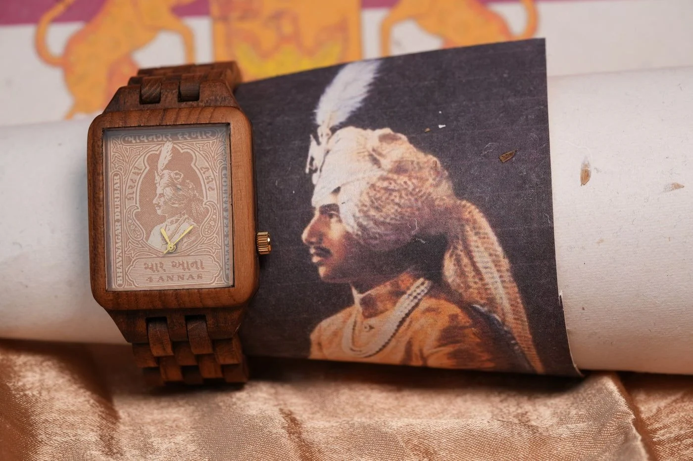
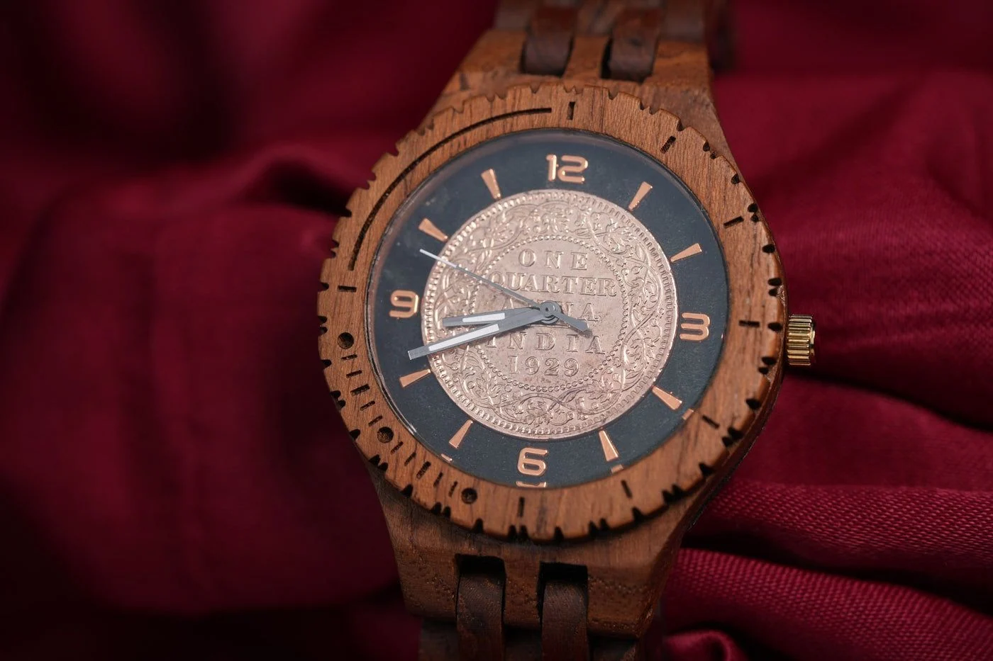
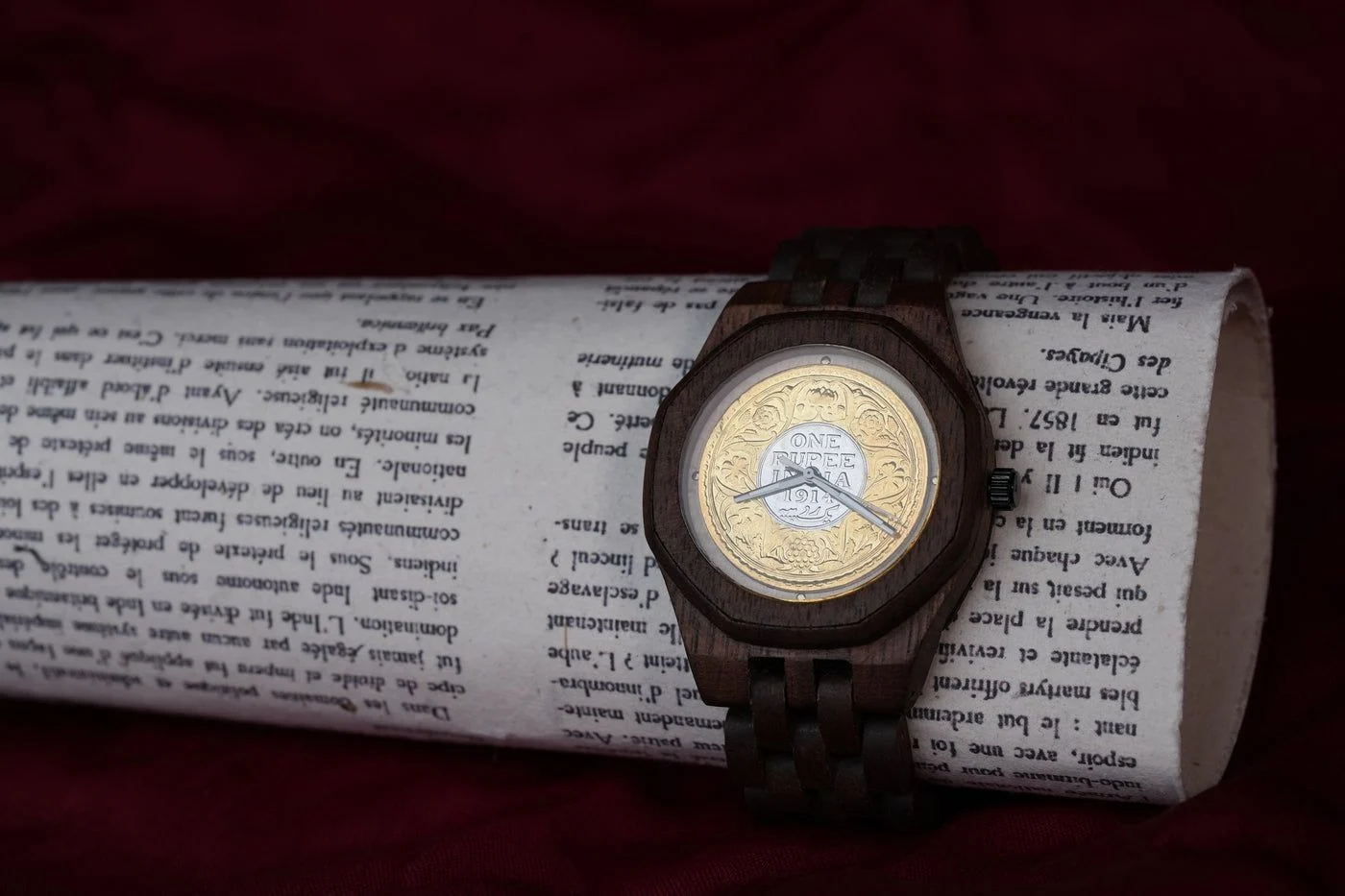
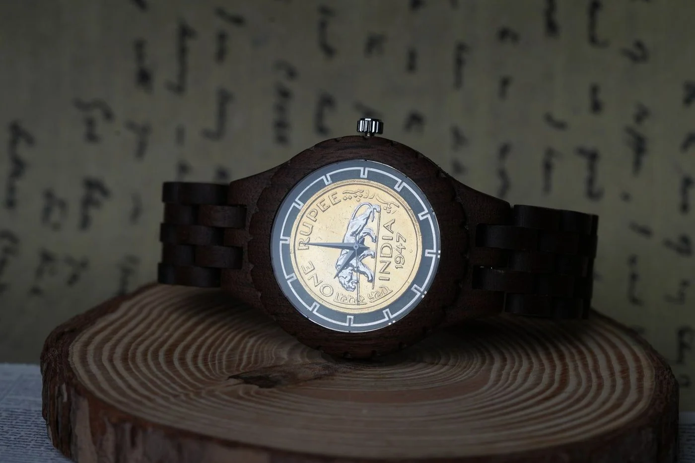
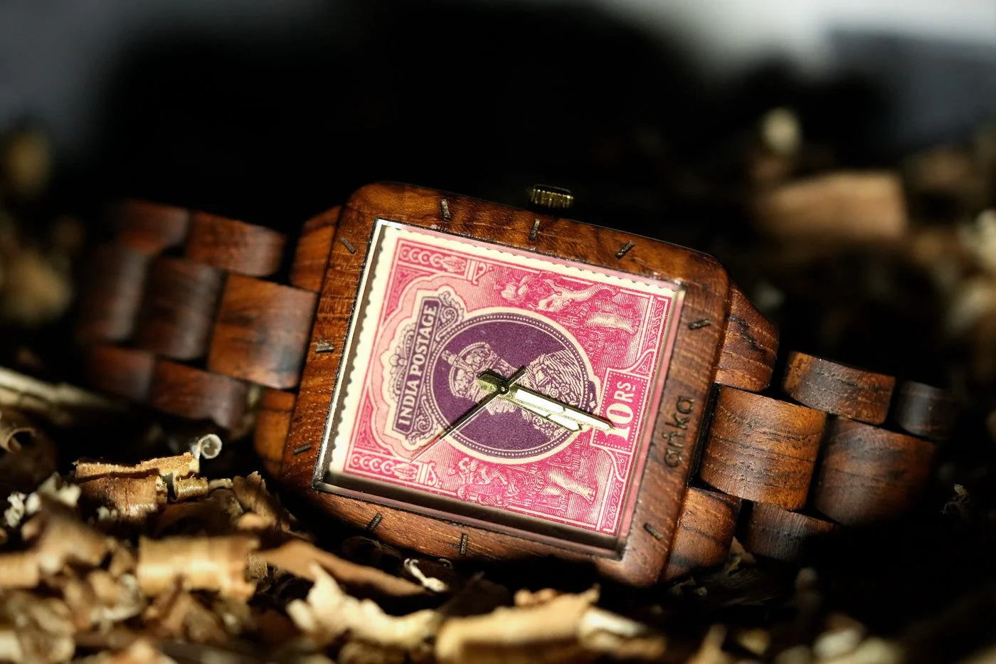
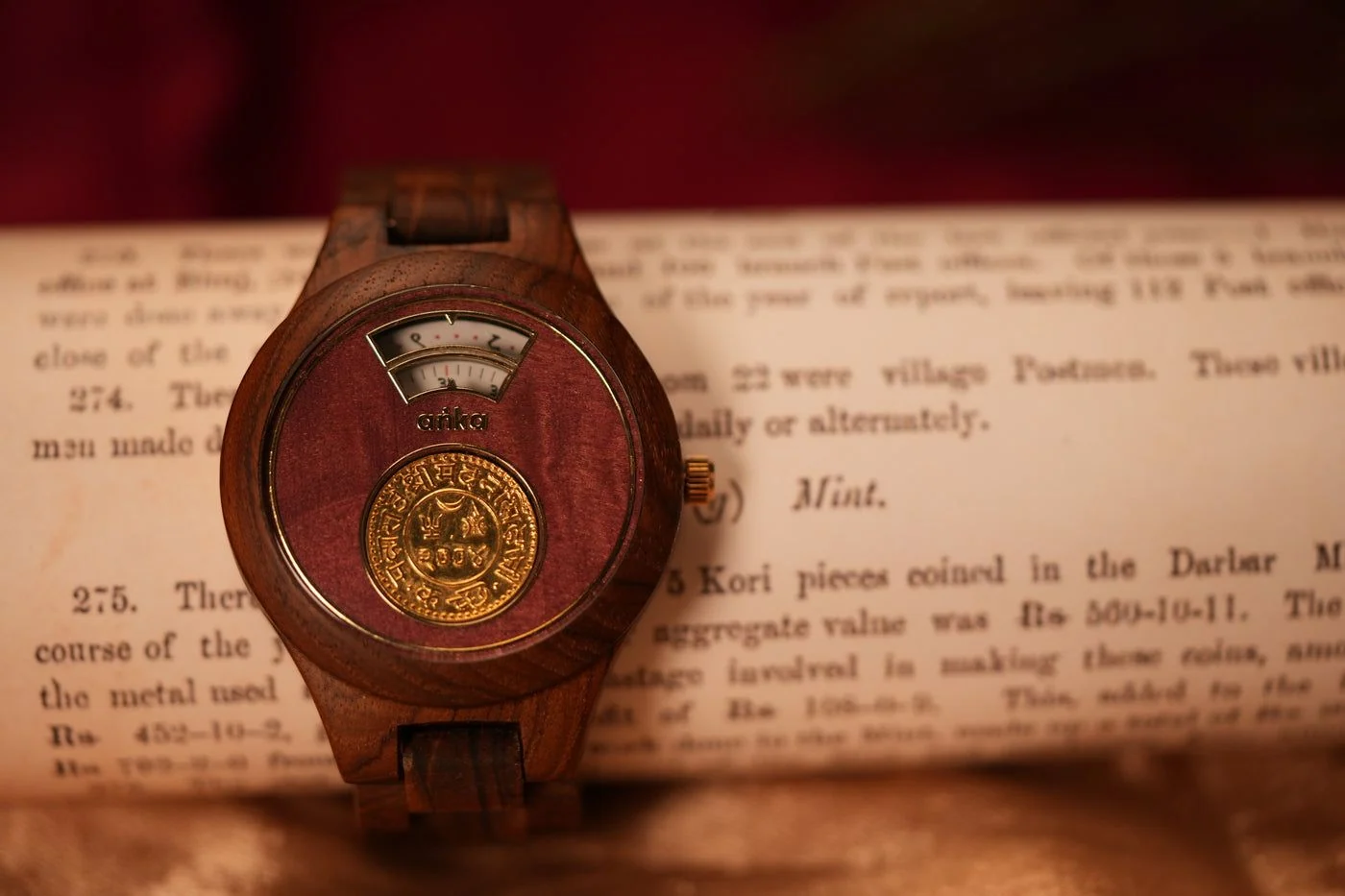
SURFACES OF THE SHOOT
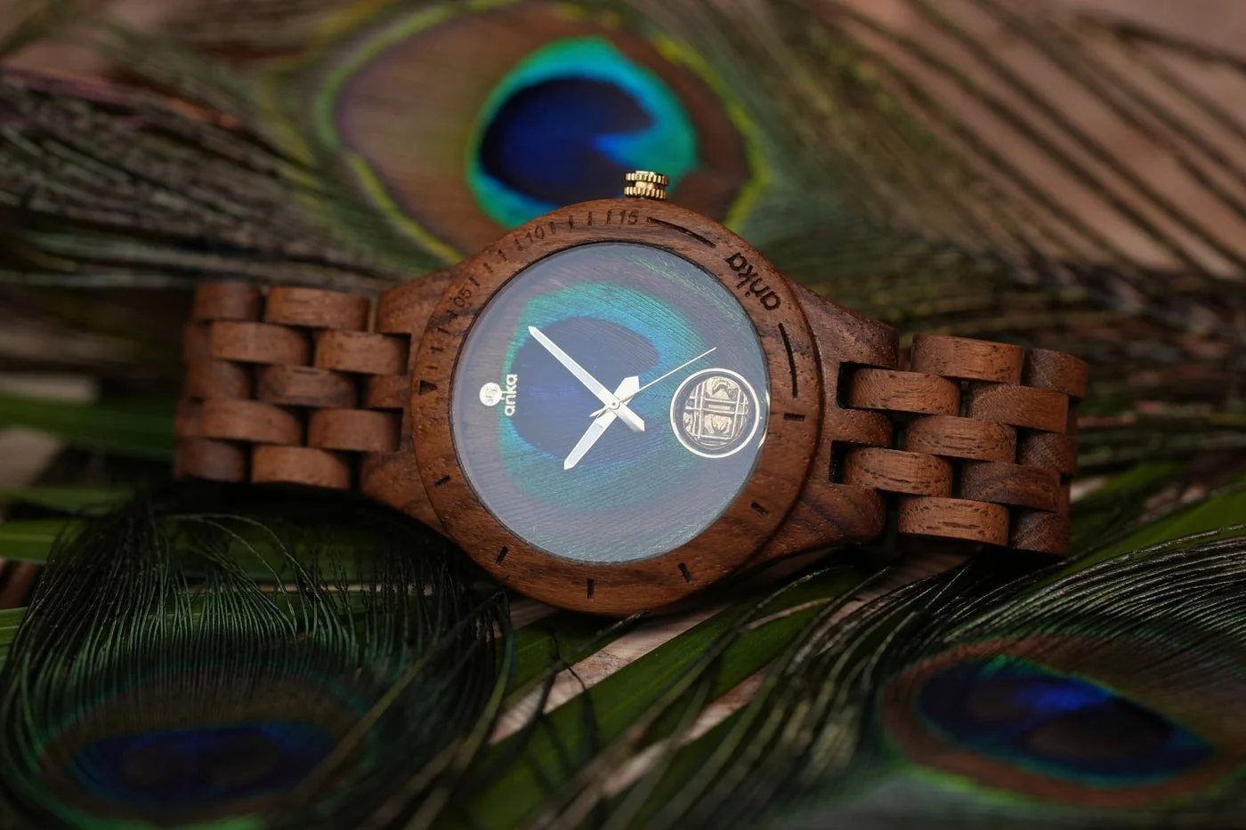 Peacock feather
- Aged map
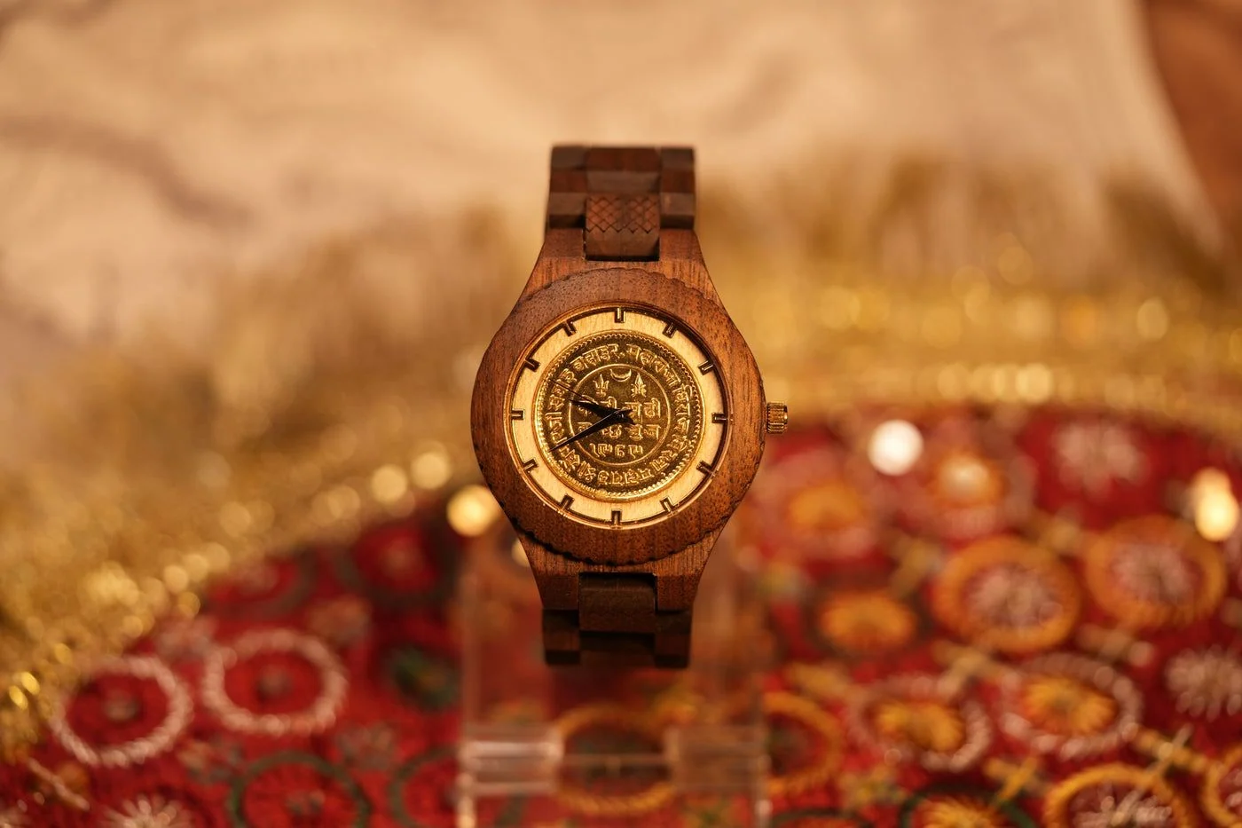 Brocade
- Newsprint
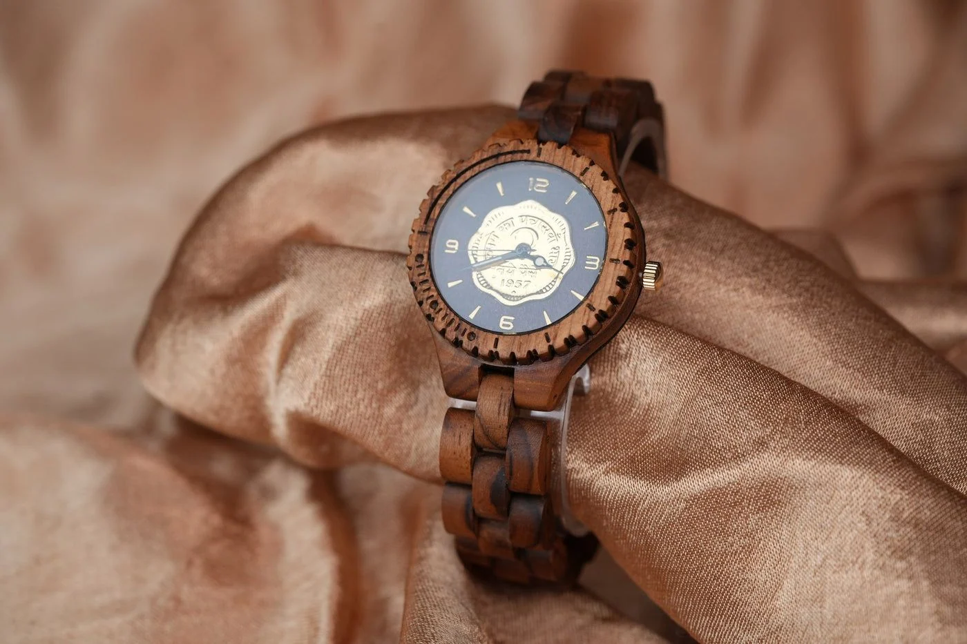 Raw silk
ERA 11 · THE COLLECTION
Every Timepiece Carries a Different Story
ANKA's collections connect watches with historical coins, stamps and the eras they represent. Through photography and communication, Granth made these details easier to explore while keeping each timepiece individual.
18TH CENTURY
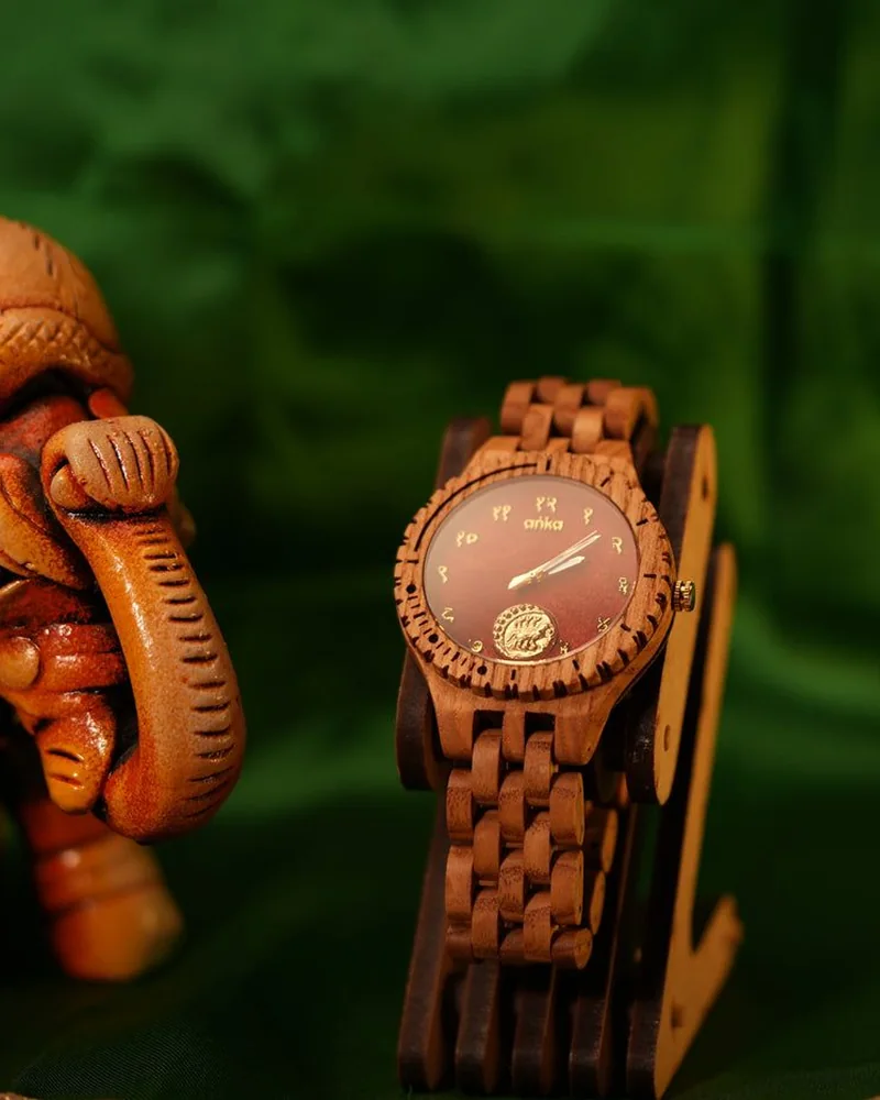
1800 — 1850
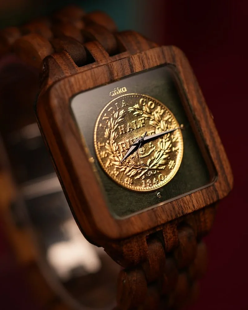
1900 — 1950
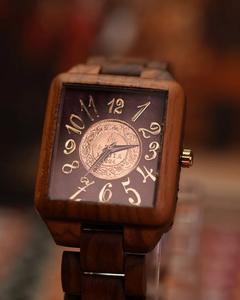
1900 — 1950
1900 — 1950
1900 — 1950
1900 — 1950
1900 — 1950
1950 — 1975
1950 — 1975
Era 12: The Outcome
From a Distinctive Idea to a Complete Brand
What began with a distinctive idea grew into a complete brand experience. From naming and logo design to the website, social media, videos, user guide and product photography, we worked across every part of ANKA's brand journey. Each touchpoint had a purpose, and together they gave ANKA a consistent way to present its story, showcase its craftsmanship and connect with customers.
- 01
NAME
A Sanskrit name that ties the brand to time and memory.
- 02
IDENTITY
A recognisable visual foundation for ANKA.
- 03
CONSISTENCY
Brand guidelines for a connected visual identity.
- 04
IMAGERY
A product photoshoot that became the brand’s visual language.
- 05
DISCOVERY
A digital experience for exploring watches and collections.
- 06
COMMUNICATION
Social content and video storytelling across platforms.
- 07
GUIDANCE
A user guide and how-to-wear video for everyday use.
Have a Brand Worth Making Unforgettable?
ANKA had a story rooted in history. We helped shape how that story looks, feels and reaches the world. Your brand has its own story waiting to take shape. Let's build an experience that gives it the identity and presence it deserves.
Let's Make Your Brand Timeless


 Chat